Why New Star Trek Feels So Different
Can't believe your eyes? Well, let's take a look at how Star Trek has changed through the years.
As of recording, Star Trek has been on our screens, more or less, for 60 years. Originating in a decade when a lot of people still didn’t have colour TV. Since then, we have had movies, shows and shorts. We’ve watched it on our television screens, in theatres, on our laptops, and if you’re some kind of heathen, even on your phones.
So, of course, Trek would, and SHOULD, feel and look different throughout those years. Technology is constantly evolving. What would have been groundbreaking at the time might seem par for the course nowadays, but I would argue the opposite. It’s exactly these techniques that brought us the stories we love. Just because something is new and up-to-date doesn’t make it a better artistic choice.
The Golden Age of Star Trek, with the likes of The Next Generation, Deep Space Nine, and Voyager, had a blend of writing and filmmaking that birthed memorable, cohesive, and visually stunning science fiction… sometimes. The less said about Nagilum, the better.
There has been a shift in the way media is made that, over recent years, has stuck out (to me) as strange, obstructing, and sometimes, bad. Like many TV shows in this current streaming Era, Star Trek has fallen into these similar habits. And, as an editor for TrekCulture, I have found myself interested in the what and why of this. I wondered if it was possible to break these things down into separate parts and dissect them, figure out what it was that made them feel, or perhaps not feel, like Star Trek.
This article will focus on the physical construction of the show, rather than the writing behind it. One thing at a time, and I’m trying not to unite the audience against me - Although, while I do believe a similar ethos to what I’m about to describe could be used when looking at the writing, I am simply just one man with a film degree! Jesus Christ, get off my back! Instead, I am taking a closer look at the visual side of Trek, and why it feels so different now than it did 20 or so years ago.
There are many avenues to take while working out these issues, but I wanted to start with a simple question - Where are all my starships at?
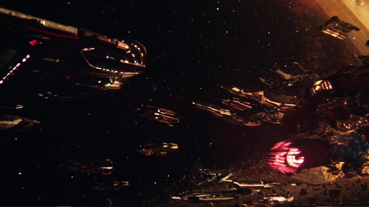
Star Trek has given us many beautiful shots of those starships flying by. Here's the plot twist: they started to over-rely on them - this was made famous in The Motion Picture, and then later ribbed in the Lower Decks Episode: Crisis Point. But I feel the opposite has occurred after the last few years. As part of my work, I am often searching for those swooping and panning shots of ships flying past, sometimes into the distance, sometimes directly towards the camera. It’s easy to find when watching anything from The Original Series to Enterprise. Even Voyager has a fair few, if most of them happened during the closing shot and were therefore obstructed by text, GODDAMN IT.
But when traipsing through episodes of Discovery or Strange New Worlds, I found those beauty shots to be lacking, or sometimes, missing entirely. Some episodes do start with an exterior shot of the ship or a runabout, but in these cases, I find it to be less “beauty”, and more “playstation 3 sounding as if it’s about to take off’ - what I mean by this is, there tends to be so much VFX happening on the screen that I’m left looking at a pixilated grey mess of metal and lens flare. The end of Discovery’s first episode, The Vulcan Hello, is a good example of this. The entire scene is a washed-out brown/grey murk of ships that all look vaguely the same. And when you try to peer closer, you get repeatedly blinded by blue lens flare. I’m not sure if I would prefer more shots if the shots we do get look like this. Compare that to a crisp clip of the Enterprise D from The Next Generation. The technology used may have been less advanced, but the feeling is far greater.
I don’t want to sound like a dinosaur, banging on about how shooting on film and physical effects are better - but, well, okay, I guess I am sort of saying that. This will all make sense, I promise, I’m getting somewhere!
Even the visuals of a ship going into warp have changed. No longer do we have the extended nacels of the Enterprise D as it warps off into the sunset. Well, not the sunset, just the sun, and not even then. Just space, really. - And when we do see it, like in the Strange New Worlds episode Shuttle to Kenfori, it’s visually cold. And do you remember when the Enterprise D would drift past the blue planet, or the green planet, or the red planet? - simply to explain to the viewer that this is the particular planet of the week where our crew will have their diplomatic adventure.
Emphasis on diplomatic.
You see, it’s easy to say that this is just my preference, and that we had this style of pacing for so long that it’s refreshing to do something new, but I believe this was an important aspect of what made Star Trek feel like Star Trek. There was action, and yes, there was romance, but Star Trek was always, and in my opinion, at its best, when cerebral - even when the episodes were more action-focused, the style of filming and editing still served the story, and helped enhance the quieter moments. It was a show about diplomacy, exploration, and moral queries that needed time to be scrutinised and studied.
These shots were not only eye candy for the ship nerds, but breathing space for the viewer. Even during the tense moments, think of it as two battleships slowly approaching, rather than two aeroplanes flying past each other in a WW2-style shootout like in Star Wars. As the two ships need time to work out the situation, and for captains to give orders, we, the audience, need that time too, to get the full effect and tension of the scene. When an episode starts with an exterior shot of the Enterprise, the audience has time to sink in.
When the ship goes into warp, it’s obvious that decisions have been made and action is to be taken. Every exterior shot should be in line with the pacing. And when I think of the editing of Star Trek, I don’t think of a fast-moving show that doesn’t pull its punches and wows you with a new explosion every five seconds. I think of long shots of stuffy officers talking around a table. Wow! This diplomacy is knocking my socks off! I’m at the edge of my seat!
The writers and producers of current Trek, specifically the live action shows, beginning with Discovery, have moved to a different style and format, approaching the show with a more romantic and character-focused lens - but what’s more romantic than the exploration of space? And what better way to show us, rather than telling us, than by literally showing us that exploration?
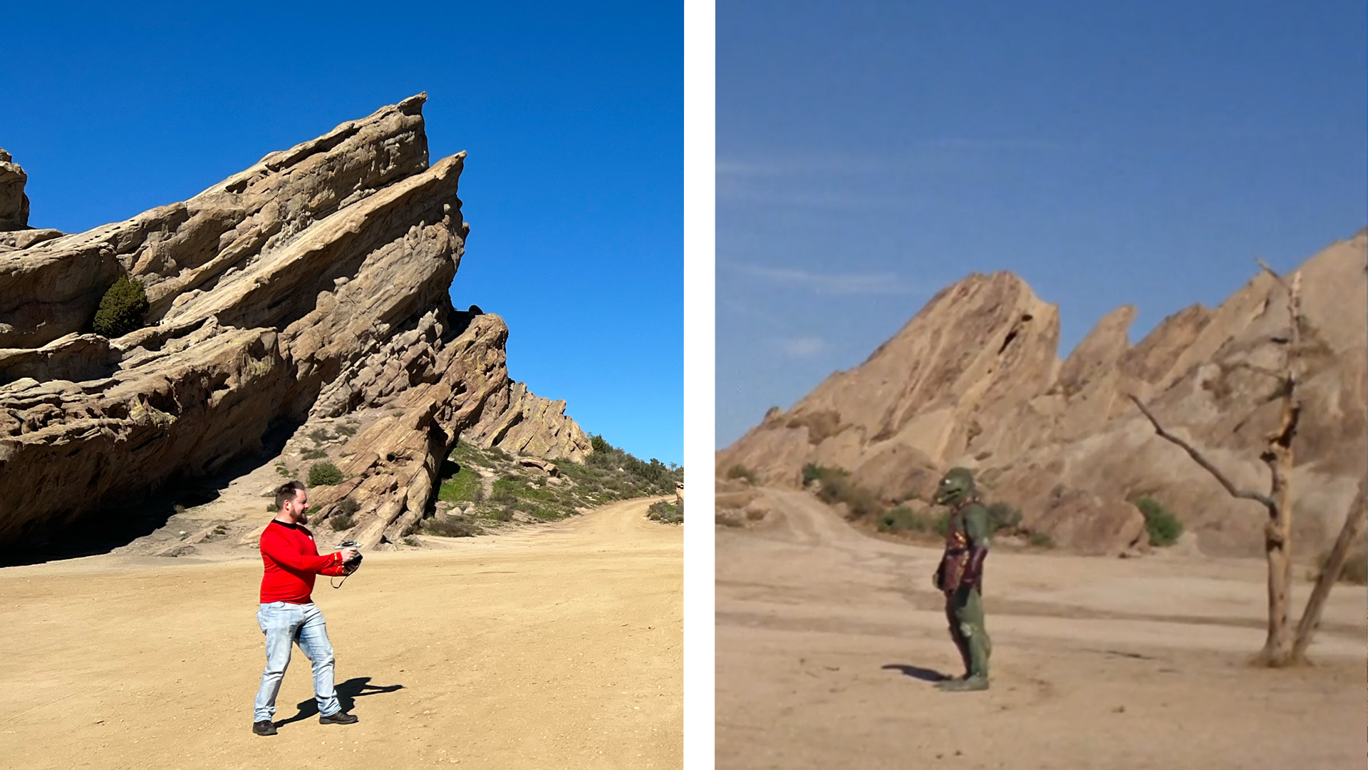
The characters of the show were always extremely tied to the ship or space station that they were on. The Next Generation was a luxury cruiser, with carpets and cocktails. Deep Space Nine was a Cardassian mining facility built via slave labour, and those panning shots never let you forget that, the sombre exterior being stooped in history. Look at The Original Series - a show described by its creator, Gene Roddenberry, as a “Wagon Train to the stars”, and I believe this to be visually true. There was an Americana vibe to the show, with its triumphal theme music, its slick, wizzing starship, and, of course, the Vasquez Rocks.
It’s a great shame, knowing how much work is put into those CGI shots of ships in Strange New Worlds and Discovery, just for them to look rushed or blurry. Discovery’s season 4 episode: Coming Home, has a scene with a Space Station in warp. That sounds cool, right? WRONG! Well, it is kinda cool. But again, the whole thing looks cold, with what feels like a dirty film placed over the top. Various VFX Houses worked on Discovery, including Ghost VFX, Pixomondo, and Cause and FX (great name, by the way), with Jason Michael Zimmerman as lead supervisor for all seasons. When looking at some breakdowns of VFX shots in Discovery, there is a layer or two added to each scene that looks to be the cause of this dirty film I was talking about. It looks to be a blend of mist, lens flare and screen smudge. I am not blaming the supervisor or the houses for this, as creating a show is a long, collaborative machine that involves many hands and ideas. And, of course, I am not saying visual effects are inherently bad or easy to do - far, far from it. The issue, for me, is the outcome. There is a sense of believability that runs through these choices, but that doesn’t always equate to good filmmaking. The scene in which Kirk is fighting a man in a costume is silly and extremely unbelievable, but damn, is it not more iconic than almost every CGI shot in Discovery? What makes art so interesting is it doesn’t matter how long or how difficult something is, if by the end of the process the piece of art you created doesn’t cause an emotional reaction within the viewer. You can’t pretend to like something just because it was difficult.
And don’t even get me started on those digital zooms that leave me feeling sick to my stomach. These are an extension of that realistic style to filmmaking that we’ve seen ever since the UK Office, adding documentary camera work to create a sense of, dare I bloody say it, believability. But The Office was pretending to be a real documentary, where Star Trek isn’t! Except when they were, but the less said about What is Starfleet, the better.
While on paper, a ship capable of jumping suddenly in and out of space via mushroom technology sounds cool, it only serves to remove that sense of scale - space no longer feels grand or overwhelming, it is no longer full of possibility, but a sandbox for us to pop in and out of.
But while this is an example of underutilisation, Discovery and Strange New Worlds are also guilty of overdoing it. Coverage is a term used to describe the use of multiple shots or cameras to shoot all aspects of a scene. It can be a tool to make sure you cover all possible ground before you reach the editing stage, but it tends to make for an unfocused and messy outcome. It’s most egregious during scenes where 2 or more people are talking. The camera is constantly moving and cutting, sometimes between shots that are barely distinguishable from each other.
If you go back to something like The Next Generation, a show that is famous for scenes of people talking in rooms, the setup is clearly very different. They start with a wide shot to establish the place and the people, then they cut in. Sometimes these shots linger for a while, only cutting away for the odd reaction; other times, they might remain for most of the duration, possibly with an added dolly in or out. Dialogue scenes like these are some of the most common things a director will have to deal with, and while it may seem simple, there is a lot of consideration at play. Like before, when moral issues are being discussed, the audience is given the proper time to think and digest. The show was known to use long single takes, so as to not distract from what is important.
When watching Discovery or Strange New Worlds, it is difficult to know what is important. In the Discovery episode Under the Twin Moons, we have a classic around-the-table scene, where four characters have a nice chat. Or I guess it’s not a table, or a display unit, but a holographic display? Which is a whole other complaint of mine, so hold your horses for that. I’ll get to it. Anyway, during what should be a simple camera setup, quickly becomes a bit of a mess. It starts with an establishing shot, then we quickly break the 180 degree rule (for those of you who don’t know, its where the camera stays within 180 degrees to stop the audience from getting confused. It’s not always necessary to stick to, but I would say it is here) this is then followed by multiple quick cuts to various characters during some dialogue that gets completely lost.
The progenitors want to do what? Did she just explain why the Breen are made of green jelly? I’m so confused.
With the constant movement and cutting, it feels to me that we, the audience, are being told 1 of 3 things.
This scene is boring, so we needed to do something to keep you interested.
You don’t have the attention span to listen to this important information, so we found a way to keep dangling the keys in front of you.
Look how cool we are! The camera goes from left to right, up and down! Watch it float over here and over there! Isn’t this such a cool sci-fi show!
A show should be confident in itself, and Discovery, Strange New Worlds, and even Picard have never felt confident to me. Not just due to the constant changing of tone and storylines, but the style in which it is edited and put together makes me believe that the showrunners, or producers, don’t have faith in their own work. Picard is an obvious example, with each season feeling vastly different, not just in the writing, but everything from style to colour. Finally ending on a crowd-pleasing final season that took us back to some of what people loved about Star Trek - watch some of Picard season 2, episode 6: Two of One, for example, and then go to season 3, episode 7: Dominion. You might find it difficult to picture them as being from the same show. The strange, light-hearted, earth-based season 2 feels light-years away from the dark, space battle setting of season 3.
Discovery started as a very blue and very cold-looking series, the colouring and visual style focusing on starkness; only for the final season to embrace a slightly brighter, warmer tone as it leaned into the action adventure side of things - watch ANY episode in season 1 compared to any episode in season 5. Even the jump between 4 and 5 is pretty extreme. As each season tried to work out what it wanted to be, and what would work with audiences, the choppy editing and ice-skating camera operators continued to leave me feeling nauseous by the end of each episode.
Was this a fast-paced franchise that kept you on the edge of your seat? Or a cerebral exploration of morals and space? Sure, it could be both, but the visual language needs to represent that
Starfleet Academy, on the other hand, has taken the opposite approach. Instead of the choppy editing, we have long continuous takes, while still engaging in floaty camera work. They have opted for wide lenses and extreme close-ups. I believe this was to give the show that rose-tinted goggles feeling you get when thinking back to your time at college or school. Not that I have that for my time in education, for me, it’s more like goggles smeared in shit. In that sense, I think it achieves what it is trying to do - but I do think the style has gone too far the other way. While the brighter tone, with sets that have some actual lighting, is a breath of fresh air, and defiantly adds to that Starfleet Academy aesthetic - I do think grounding the camera work just a little bit more would help give the show a touch of reality that I think it would benefit from, helping give scenes that are supposed to be more serious or important some weight. When everything is dreamlike, nothing feels real.
I can hear people typing now - “This guy is never happy!” And you know what? You’re right! Hahahahaha! But I would argue that creating the perfect style and visual feel to a film is an extremely difficult thing to do. Any tiny slip-up or out-of-left-field choice could cause a domino effect on the entire project. Plus, this is only my opinion; what works for me might not work for others, so why don’t you just leave me alone?
Music is used differently, too. Of course, Star Trek was famous for its musical stings, letting you know that the next segment is about to start, and to keep you on edge until it does. This was utilised as part of the five-act structure - Act 1 being the Teaser - Act 2, the Inciting Incident - Act 3, the Rising Action - Act 4, the Falling Action - and Act 5, the Resolution. These five structural acts were made with the commercial breaks in mind; of course, this isn’t exactly a problem when it comes to streaming services. But the use of music still stands.
Similar to its editing style, Strange New Worlds doesn’t seem as confident in its audience; instead, using the music as a base layer throughout most scenes. It’s possible you never noticed it, and I’m deeply sorry for pointing it out, BUT, go watch a scene from Strange New Worlds and listen out for the constant orchestra, desperately trying to let you know how to feel at each given moment. To me, this sucks away the mood of the dialogue and distracts me from my own feelings toward what is being said. I no longer feel sad, or happy, or tense. Instead, I feel nothing. Empty. A husk. Worthless. Stupid… hold on, my therapist is calling.
From The Original Series to Enterprise, with a few hiccups here and there, Star Trek was a show that knew what it was and was unashamed of it. If you didn’t like it, then fine, but it would never hide itself; it was never scared to tell you to sit, shut up, and pay attention. Of course, certain episodes could be used to argue against this - The Next Generation’s The Offspring and Symbiosis, for example, both led with a strong message, but seemed to pull back, afraid to explore these troubling themes further.
But like I’ve said, the problems that I feel a lot of current Trek is dealing with are tackled by most shows in this streaming era. Which leads me to my next topic.
I am not the first person to bring up the current issue with colour grading and lighting in recent film and media. All the way back from Alien Vs Predator and its sequel, to Solo: A Star Wars Story, and even… bloody Superman? We have been witnessing the ever-growing murky waters of “realistic filmmaking” (sorry, I just did a little sick in my mouth). Famously seen, or unseen (pause for laughter), in the last season of Game of Thrones, the choice to poorly light certain scenes has become a standard for modern filmmaking.

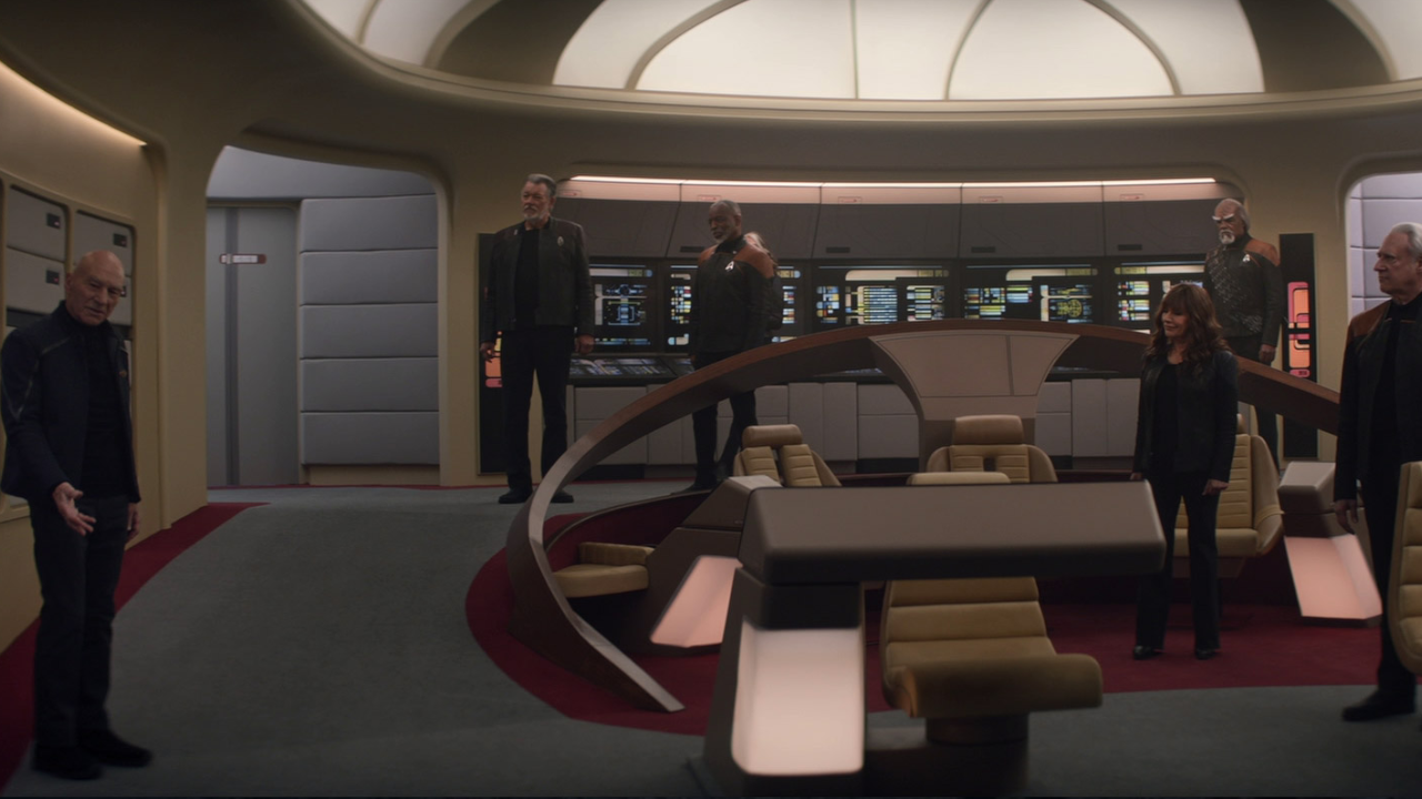
And I don’t feel like I am being harsh when I say (a lot of) it is poorly lit, and possibly poorly colour graded, too. Just look at the last season of Picard, with whatever the hell happened there! We were given extremely dark and strangely graded versions of half the season, which felt to me like a great parody of what audiences had been dealing with for some time! Even when these were fixed, there was a clear aim to keep the lighting moody and dark, and possibly, dare I say, edgy. Then, in the same season, the scenes on the Enterprise D were a lot lighter (not as light as in The Next Generation, but still). It would have been a mistake to shoot the interiors of the Enterprise D in the same lighting and style as the Titan (looking at you, with difficulty, Star Trek: Generations), especially after not seeing it for all this time - but it did emphasise the dim moodiness of the rest of the show’s interior shots. Even the dark, leather clothing seemed a bit odd on the carpeted luxury cruiser. While this resembles the shooting style of Discovery, the exterior shots of space in Picard Season 3 far more resembled those of The Next Generation and Voyager, keeping them bright with various light sauces. The ability to SEE these space scenes was clearly a deliberate choice, especially for a season that spent most of its time in space.
But dark doesn’t mean edgy, and it certainly doesn’t mean realistic. If it's not dark, then it's washed out; if it's not washed out, then it's full of bloody lens flares like Discovery and the Kelvin Universe. Making the audience struggle to see what's happening doesn’t create a tense scene, just a confusing one. Gone are the days when TV was shot with beautiful film and filled with light and colour, allowing the audience to immerse themselves in whatever strange occurrences were happening that week.
There have certainly been occasions where New Trek has given us some lighting and confidence in what it wants us to see, but even then, there is that Streaming Era, washed-out haze that is so sadly common. I find it incredibly frustrating that this style of filmmaking has become so popular. Perhaps it’s due to the type of digital cameras that are used on most sets, like the RED, but whatever the reason, it must stop. Now, please. Oh God, stop.
And if you haven’t noticed this, keep the idea in your brain and go watch some of your favourite scenes from The Next Generation or Voyager, and then flip over to Discovery or Strange New Worlds. Whether it’s supposed to be moody and dark or set during the middle of the day, you will still notice that under-saturation that bleeds into every scene.
Following on from how the scenes are lit, the way they are designed has a huge impact, too. Of course, I am one of those that longs for the carpet to return, even Voyager and Deep Space Nine lacked that warmth for me, BUT, some of the current Star Trek shows have gone so far the other way, I feel even the word carpet would be laughed out of the Paramount building.
That “this is a cool scifi show” feeling comes back around here, with the shiny surfaces, the colour palette, and the enormous rooms and hallways. The saying “just because you can, doesn’t mean you should” comes to mind with these choices. In an age where the cost of creating a show seems to be so high, I am always baffled by the expense used for the sets and CGI - why are the captain's quarters so big in Strange New Worlds? Why is the atrium the size of a hotel? And what the hell is an atrium?
Looks it up
Ah, fair enough.
The scale and tone of the sets only create a cold, empty atmosphere, which, for a show like Strange New Worlds, does the complete opposite of what they are trying to achieve. However much I miss the carpets, at least Voyager, Deep Space Nine, and Enterprise’s sets complement the tone of those shows pretty perfectly. Strange New Worlds is jolly and character-focused, while the sets leave me feeling sombre - the reflective metal looking more like a desert chain restaurant than a spaceship from the future. Discovery sets, however, not to my taste, do fit the style of the show a little better. It started in a harsher reality than we were used to seeing in Star Trek. Starfleet were at war with scary Klingons from hell - the cool tones and sterile metal of the ships reflected this.
But then come those flames.
Why?
Why are there flames on the bridge? This isn’t Mad Max.
Discovery, Strange New Worlds, and parts of the other recent shows do have an affinity for CGI, and especially the AR Wall. I am not opposed to visual effects in this way, and of course, we have seen them used time and time again in Trek over the years, but it is how you use them that counts. I am a strong believer in the benefits of using practical effects. 1982’s Blade Runner is one of the most stunning science fiction films of all time, and all the effects were done in camera. The 2009 film, Moon, used miniatures and models, which were then altered with CGI to remove strings and help with the believability.
Read this Guardian article for more details - https://www.theguardian.com/film/filmblog/2009/aug/14/moon-sam-rockwell-special-effects
These two worlds of effects making can be used together, rather than one over the other. Some of the more recent uses of this, elements of the Gorn in Strange New Worlds, for example, have been a triumph. We know none of this is real, but the human mind is more willing to accept a puppet as actually existing than it is - whatever the hell Enterprise was doing in that one episode. Foam boulders painted in grey may look tacky, but CGI rocks can look uncanny, which, once that happens, can take a while for your brain to settle back in.
Linking back to the lack of long beauty shots, the choices made with certain future technology in Discovery have a similar effect. I would argue that what makes “discovering” something fun and interesting is the journey to that discovery. But, with the addition of the spore drive, we now get a ship that can BAMF in and out when necessary. Yes, you could argue that this is just a continuation of warp, no, not Worf, WARP, but warping still had limitations; it still meant the ship would travel from one place to the next.
Actually, when a ship goes at the speed of light… QUIET NERDLINGER! I’M TRYING TO MAKE A POINT HERE.
This ethos is continued throughout the show, especially once they zap into the future at the end of Season 2. Sorry, Chief O’Brien, we no longer need you in the transporter room; the characters can press a button and appear wherever they want. They’ve used these personal transports in Starfleet Academy, too. The third episode: Vitus Reflux, uses it both as a gag - a 1970’s comedy prank a la Porky’s, as well as during the Paintballing in Space scenes to teleport them to the sidelines once they’ve been shot. They work a little better here when it comes to the pacing of the show, but I fear the same issues I had with them in Discovery will be rearing their heads soon enough. This, and the spore drive, seem to be an extension of those previous ideas (warp and transporters), but lack the human interaction, the sense of exploration, and the needed breathing time between one scene and the next. For me, it feels like an excuse to not only speed up parts of the story (which, to be fair, was one of the reasons the Transporter was invented in the first place), but to show off their cool VFX.
Holographic displays (see, I said I would get to it) have been a bugbear of mine for years. I blame you, Minority Report! What might have felt like a cool new idea back then has now been so overused that it feels almost cheap. From Marvel, to Avatar, to Bamzooki - this blue floating graphic is so expected and overused, I find myself rolling my eyes whenever it appears. I also believe this particular bit of CGI trickery is used due to how easy it is to implement - get your actor to wiggle their hands about and just throw in the graphics later. Surely a director, producer or writer would prefer to come up with something more unique? More interesting to block with actors? No? Fine. I am being a bit glib here, and I don’t actually blame most directors for this, considering a lot of franchises that use this aren’t created by a singular voice, more likely a board meeting of stuffy men in suits - like in Star Trek! It’s all linked!
Anyway…
This, of course, leads me to the AR Wall.
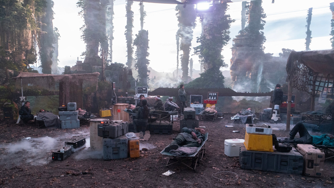
Whenever we see our characters in a space larger than your simple room, or on an alien planet, I find myself trying to see where the practical set ends, and the digital one begins. Which I find pretty simple to do, as looking at any behind-the-scenes footage of the AR Wall will show you - it’s usually just beyond those rocks there, no, not those, those are digital, yeah, those ones. Again, I believe the human brain can notice the difference between practical and physical. The way real lighting hits the actor. The dirt on the ground - Compare this to the out-of-focus, fuzzy look of the alien planet behind them. We’ve been using these sorts of techniques since early cinema, whether it's rear screen projection or a matte painting. The AR wall is a sophisticated update of this, using the Unreal Engine to keep the digital background moving alongside the movement of the camera. This means that what we are seeing is IN camera, rather than added on later. I still find the technique a little uncanny, however impressive it is. I believe this is caused by the use of CGI over practical effects. If I could give an example, picture the Simpsons Treehouse of Horror Episode: Homer3. The ending shows a fully 3D version of Homer in real life. Pretty strange, right? Now, reverse it. A (mostly) CGI background with a real person in front of it. Am I making sense?
With so much art in this world, and so many techniques to hand, why do we always fall back on the thing that has been bothering people since the Star Wars Prequels? This might just be a me problem, but I believe the gimmick that once wowed us has now run its course. I am not saying we bring back the green or blue sound studio from early The Next Generation. But… I am saying we bring back the green or blue sound studio from early The Next Generation.
Really, what I would prefer are sets that are 90% practical, only using CGI to fill in the very background - similar to the film Joker, or the TV show Deadwood. Even if you could tell that there was a green screen in the very distance, it didn’t matter as it served its purpose - that purpose being: filling in the gaps that either the budget couldn’t allow for, or expanding the very edge of what practical effects could achieve. The AR Wall doesn’t feel like it is serving a purpose anymore; instead, it feels like the producers of the show are coming up with a purpose to use it. There are a myriad of real-world locations that could be used as a planet stand-in. The California desert made up more than half of these back in the day, from The Original Series to Enterprise. Possibly it's due to budget restraints - filming everything in a studio, rather than sending cast and crew gallivanting across the country. Which, if this is the case, the producers and showrunners of Star Trek aren’t to blame, but Capitalism - the most ancient and evil enemy of them all!
It’s easy for this to sound like “Old Man Yells at Cloud”, and perhaps I should leave some of my grievances at the door when watching a new show. But there are plenty of current TV Shows that don't fall into the traps of poor editing styles, underlit scenes, and over/under use of CGI - Pluribus and Severance, for example. Two sci-fi-esc shows that are confident in themselves, and know how to light a damn scene!
We HAVE experienced a couple of these ‘old school’ techniques come back into fashion with some of the new Trek shows. Picard Season 3 - well, elements of it, of course. Close the curtains, love, can’t see a bleeding thing!
Lower Decks and Prodigy, too, while being animated shows, carried on elements of that Star Trek aesthetic that we all know. And, while these shows were both never shown the love they deserved, they were never less confident or sloppy, or even pandering because of it. They started with a strong identity and carried that on through to the end.
Star Trek has been around for 60 years, and is likely to venture on for a lot more. It can be many things. Enter many worlds. But when something shows so many signs of change and uncertainty in itself, why not look back at what worked? I’m not saying every new Star Trek should be like the old ones, and I certainly don’t want a copy-and-paste type show either. What makes Star Trek feel like Star Trek is ultimately personal to each individual - but a consistent style was established in the late 80s, and it allowed the show to…clears throat…live long and prosper…sorry…for 15 years of some of the best and most memorable science fiction we have ever seen. At the end of the day, that’s all we really want, isn’t it?