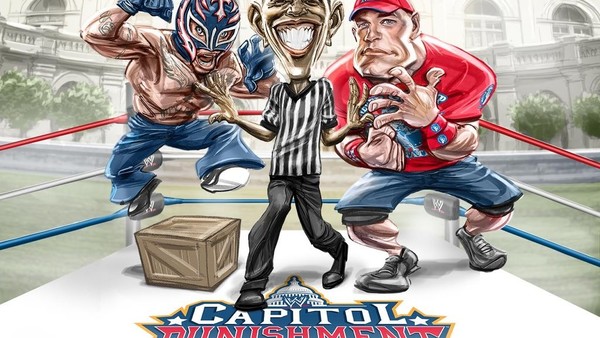
10 Worst WWE Pay-Per-View Posters Ever
Feast your eyes on these!

WWE makes things way too complicated sometimes.
If you look at a UFC or boxing poster, you'll see they heavily feature the biggest match on the card. If you're interested in those competitors, it's enough to make you want to see the fight. It's simple, but incredibly effective.
As we know, wrestling is pre-determined, but they’re still in the business of selling fights to the masses. Upper management seems to have forgotten that. If you check out the poster for WrestleMania 2, that’s how it should be done. Hulk Hogan vs. King Kong Bundy, along with their photos. The undercard is then listed underneath. It captures the show perfectly, and let's you know what you can expect to see. Now, it’s all about being cute.
If you look at 90% of WWE posters they come up with these days, you’d have absolutely no clue who is facing who.
Clash of Champions has all six champions on there and...what exactly are they going to do? Get together and play the trombone? Backlash has Dean Ambrose’s face just looking at us, as if he’s rather upset about something or wants to angrily kiss us. We're not quite sure. And No Mercy 2016 is...well...we’ll get to that in a bit.
From WrestleMania I to the present day, here are the 10 worst WWE pay-per-view posters ever.