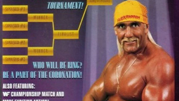
10 Worst WWE Pay-Per-View Posters Ever
10. King Of The Ring 1993

Hi Hulk! Who are you fighting tonight? Or are you just going to be flexing your muscles in front of a purple backdrop? If it’s the latter, I don’t think I’ll be ordering the show.
This is the earliest entry to make the list chronologically, and perhaps to most, it just looks largely boring and harmless. But King of the Ring 93 set forth a disturbing trend. It was WWE’s 29th pay-per-view ever, and the first poster to just feature just one wrestler.
It's hard to get excited for a show, when you have absolutely no idea who someone is going to be fighting. For Hogan, it was Yokozuna that night. I know the man is quite large, but could they not find enough room to fit both of them on there?
Past WWF posters may not have always given us the main event, but usually at least featured some neat artwork (like those Royal Rumble cartoon ones), but King of the Ring 1993 is just...lazy.
And hey, speaking of Yokozuna...the man has quite the doozy himself!