13 Ups & 2 Downs From WWE SmackDown On FOX (Oct 4)
12. A Fresh Lick Of Paint

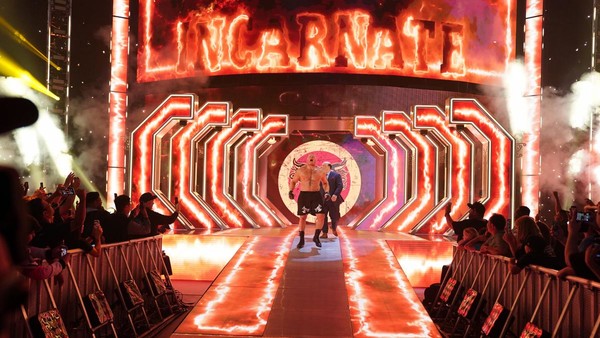
Holy sh*t, that new set design is awesome.
While Raw's Tony Hawk Pro Wrestler aesthetic feels similar to the previous wall-of-videos design, SmackDown's new layout is totally different. Yes, there are a lot of new video panels, but the four brackets at either side of the stage, new entrance tunnel, and illuminated ramp look great, as does the new lighting rig. These things combined to give SD a bold, cinematic feel every time the camera caught them, giving WWE's new A-show an A+ look.
The way a wresting show looks is important. In doing away with the old screen, WWE have erased much of the staleness that had crept into SmackDown's presentation.
Advertisement