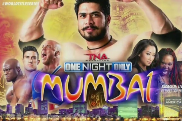
Though TNA's tour of India should make for some interesting TV, they're not exactly selling it in an engaging and appealing way, instead opting for cheesy graphics like this, with a logo that looks like it came from a 15-year-old Word Art package, and stereotypical, tacky use of all the Indian iconography you'd expect white people without much knowledge of the country to dredge up (because that's almost certainly exactly what happened here).
Stay at home dad who spends as much time teaching his kids the merits of Martin Scorsese as possible (against the missus' wishes).
General video game, TV and film nut. Occasional sports fan. Full time loon.