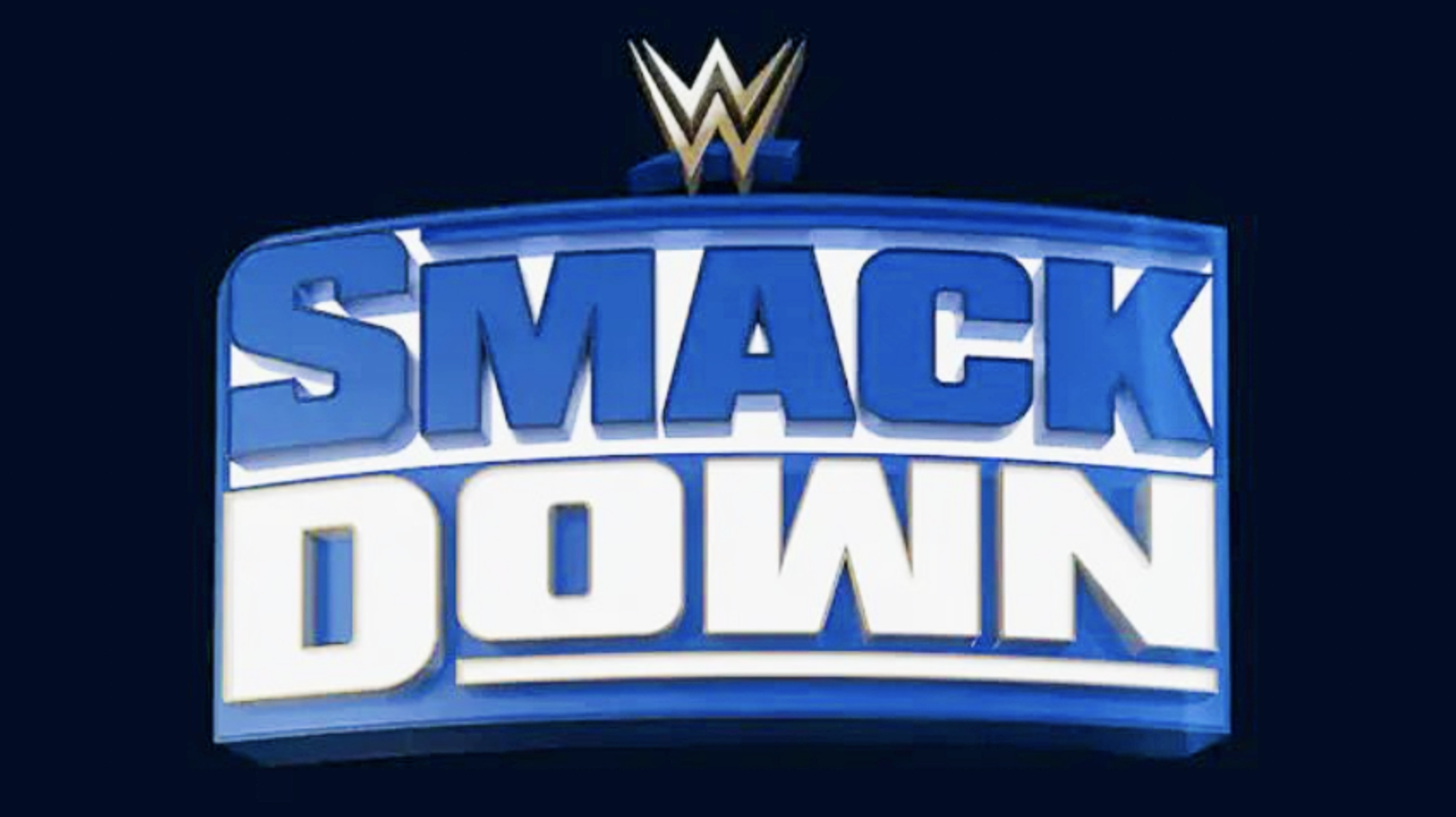
Here's What WWE's New SmackDown Logo Looks Like
Wondering what SmackDown will look like on USA Network? WWE has changed something...slightly.

See above for the tweaked logo WWE will use once SmackDown debuts on USA Network next week. It's a slightly curvier and squashed take on the flatter and lighter one shown on FOX for approx five years.
Traditionalists will be happy to know that Triple H is keeping the blue and white colour scheme. It'd be kinda weird if SmackDown suddenly changed to orange and purple, or something like that! Seriously though, it'll be interesting to find out what fans think of the "new and improved" logo.
Some will likely be underwhelmed by it, whilst others will understand that WWE couldn't deviate too far from the norm but had to change something. It's worth noting that the new logo seems slightly darker than the old one, but that could be down to the quality of pics doing the rounds.
WWE has loaded SmackDown's USA debut with some cracking matches. Cody Rhodes defends his title vs. Solo Sikoa inside a steel cage, and Kevin Owens teams with a mystery partner (Randy Orton, presumably) vs. A-Town Down Under.
What do you think of the new look?