12 Stupid Film Posters That Totally Spoiled The Movie
4. Carrie

Following the success of Brian De Palma's 1976 adaptation of Stephen Kings Carrie, the industry took a breather before releasing a sequel and three remakes, none of which come close to recreating the brilliance of the original - on account of its biggest plot point no longer carrying the element of surprise.
Everybody knows that in addition to hellish cramps and the kind of back ache that makes you want to slam your spine against a granite slab, for Carrie the monthly blood rage was accompanied by the onset of her telekinetic powers leading to a murderous bloodbath.
But audiences in 1976 probably didn't. King's novel when published in 1974 was a moderate success, but didn't reach additional printings until after the movie's release. It's safe to assume that cinemagoers weren't as au fait with the author as they are now and possibly hadn't read it.
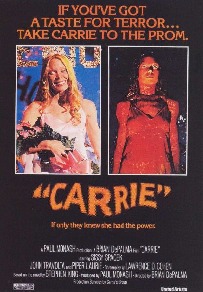
Thankfully, they didn't need to as the poster spelled it all out for them: see, there's Carrie on the left all pretty, and there she is covered in blood with an agenda of rage on the right. If it's still not clear she's going to go beserk, the tagline, "If you've got a taste for terror, take Carrie to the prom" ought to affirm it.