A Wrinkle In Time Review: 3 Ups & 6 Downs
2. The Impressive Visuals

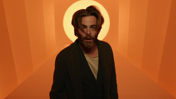
Though DuVernay sadly doesn't do enough with her sizeable budget, the film is at least handsomely mounted for the most part, thanks to both Tobias A. Schliessler's precise cinematography and sharp visual effects (aside from an all-grey tornado set-piece that looks pretty ugly).
The film undeniably looks its best when it's bright and vibrant, and in these moments, it sometimes manages to evoke the breezy, adventurous tone it was clearly seeking throughout.
All the style in world is for nought without a worthy script, of course, but at least the film is largely easy on the eyes.
Advertisement