Thor: Ragnarok Review - 9 Ups & 4 Downs
8. It Is Incredibly Stylish (In Look And Sound)

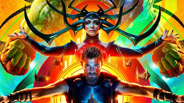
Considering Taika Waititi isn't exactly known for his visual flair, Thor: Ragnarok is stunningly stylish. It is both futuristic and nostalgic, taking in elements of Star Wars, classic Star Trek, Blade Runner and John Carter Of Mars (neither a bad source or a bad movie, for your information).
It's colourful even beyond the usual MCU palette, with delightfully weird costume and set designs that should earn it lots of awards attention for the art department and it swaggers with a charm not usually seen in high-concept sci-fi (which is what it flirts with being a lot of the time).
The references to Jack Kirby are so well-phrased that the film feels almost like a living tribute to his work. It's not just like a lick of paint in the background - it's so much more tangible than that.
It also sounds great, with a wonderful 80s-edged score (all Flash Gordon and Tron vibes) and tub-thumping rock music (Led Zeppelin's "Immigrant Song" is used perfectly TWICE, in moments that will make you want to beat your swelling chest). In the context of the MCU - which tends to be criticised for homogenous scores - it stands out beautifully.