10 Best Video Game User Interfaces
3. The Last Of Us
Though The Last of Us' UI is basically the polar opposite of Persona 5's - it's subtle and only announces itself when you need it - like that game it also compliments its own narrative and tone perfectly.
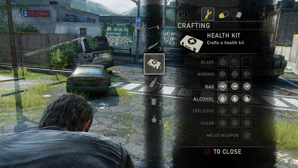
Naughty Dog's survival horror masterpiece is of course all about immersion in a post-apocalyptic landscape, so it follows that the UI and menus should be as unobtrusive as possible.
The UI was changed numerous times during development as Naughty Dog sought to make it as tidy and un-cluttered as possible, with the final design pushing the various crafting and inventory options to the background, such that they're only visible when the player needs them to be.
After a short while, navigating these menus becomes second nature through muscle memory, and this carries through terrifically to the recently released sequel, too.
Were either game clogged up with nested menus or excessive on-screen icons, it'd feel entirely counter to the immersion intended by their cinematic visuals.