Hades: 10 Reasons You MUST Play Supergiant's New Rogue-Like
3. The Art Style
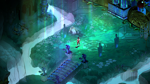
Inspired partly by Classical Greek art and Mike Mignola's strong inks, Hades' aesthetic is its first and most obvious draw, with every portion of the game looking like a work of art, from the environments to the characters to the colours and animation.
Supergiant has always been known for its fantastic visuals, with previous games, Pyre, Transistor, and Bastion all having art that anyone would love to have hanging on their wall. Despite having heavy black inked shadows and reveling in the darkness inherent to an underworld setting, the colours in Hades pop with sometimes neon shades and hues, each character and locale having their own unique colour schemes and design quirks.
Art director Jen Zee broke down much of her process in an interview with BAFTA Guru, which involved a lot of talk about how the game's sexiness and Zee's early push for artistic nudity influenced certain design decisions made on how undeniably appealing the visuals (and characters) really are.
Environmental artist Joanne Tran made the world of Hades one you never tire of looking at or playing in, and 3D artist Paige Carter brings it all to life with every design as appealing in-game as they are in their drawings.