Mass Effect Andromeda: 12 Critical Reactions You Need To Know
5. The UI Is Cluttered & Unintuitive

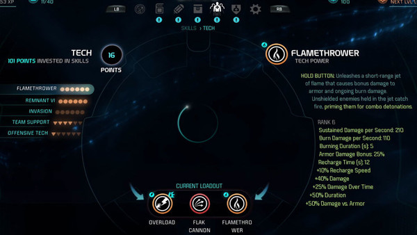
"Andromeda’s menus are an absolute mess, burying important aspects like your squad’s skill tree or the option to craft new gear. Many of its features are largely unexplained, forcing you to hunt — or, in my case, stumble upon — them yourself." - The Verge
"Andromeda has some serious issues with UI. While individual load times are not bad, the galaxy map is a chore to get through as you have to zoom in and out of each planet in an exercise I can’t imagine anyone thought was fun. You can spend ten minutes scanning a system with this method and end up with 50 iron and some scrap to sell. Granted, I don’t miss the little ship fuelling minigame or limited probes from past games, but this is still not good. Also, the quest list navigation is atrocious, putting quests into nonsensical categories that often don’t correspond to where you picked them up or where you need to go to do them. It’s an absolute mess." - Forbes
A bad UI can make an otherwise fun game feel like an absolute chore, and the menu design is a big reason why so much of Andromeda apparently feels so ennui-inducing.
Galaxy scanning was torn down by many reviewers, as was the nested quest list and the fact the game doesn't explain many key pieces of information that you're required to seek out on our own.
Considering how many complex systems the game has working at once, and how much the player is able to toy around with, it's not surprising critics feel exhausted and frustrated by it after playing the game for 60+ hours in some cases.
Advertisement