The Secret Behind Sony's PS5 Logo
It's not as lazy as you think.
Everyone was on tenterhooks to see what Sony had to show off about the upcoming PS5 at CES 2020. Would they reveal the first look at the hardware to match Microsoft? The much talked about Dualshock 5? A new launch game?
Sadly, it turned out they had no plans to reveal any of those things, but they did show off the official logo, which the Internet immediately ripped to pieces.
Perhaps because fans are growing frustrated with Sony's persistent silence, the intense similarity between the PS5 logo and that of the 4 was viewed as a major misstep for the company. A vocal part of the audience ridiculed it as being lazy, uninspired, and potentially even indicative of Sony not taking the new console seriously.
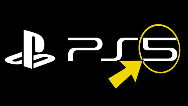
One Reddit theory does point out something cool though, that the '5' of the logo is actually the 'P' flipped upside down, with a new horizontal line to finish the number. That symmetry, admittedly, is kinda neat.
It's not really the ingenuity or uniqueness of the design that matters though, but what the logo implies. In the few tidbits they've revealed about the PS5 so far, it's clear that Sony is aiming for continuity between their machines. Backwards compatibility with PS4 games has been confirmed, current VR systems will work on the new machine, as will the Dualshock 4, and the first-party lineup will be supported by sequels to franchises and reboots that defined Sony's past seven years.
They don't want to find themselves in the same position as Microsoft last-gen, telling customers that if they don't want a radical change then they can stay in the past with the console they already own, but rather smooth the transition between machines. Sony has sold over 100 million Playstation 4 consoles, and this logo is telling those fans that they're still in safe, familiar hands.