These Video Game Character Redesigns SUCK!
3. Conker - Microsoft Hololens
Ok. So give me a minute here, as this one is still fresh.
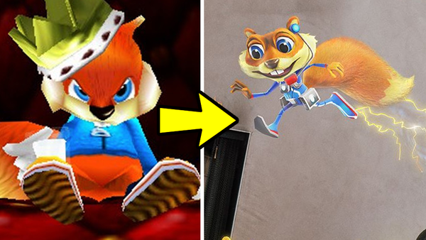
So we all know about Rare's uber rude dude mascot with a mouth Conker right? He was basically the anti-hero platforming icon that we never knew we needed. He was aggressive, he was foul, he was selfish and greedy, in short, he was my bloody role model.
So with all of this in mind, imagine how I alongside many others reacted to seeing the redesign that Microsoft gave Conker to sell their Hololens tech.
*Re-enactment*
OH MY CHRIST WHAT HAVE THEY DONE TO MY BOY? THIS BOY NEEDS MEDICAL AID! HIS HEAD LOOKS LIKE A !*$% POG SLAMMER!
It was a sad day to say the least, and while Microsoft did try and immediately distance this design from the original by stating that this was "young conker" this actually did more harm to the overall package than they probably intended. If we're to assume that this is the young Conker, then it's suggesting that the catastrophic failure of the hololens is what lead him to drinking and down a path of self-destruction.
Not exactly the vibe you want when trying to market a new product right? If anything this was more along the lines of Microsoft trying to trim all the spicy edges off of the original but ending up with a Conker becomeing a total square in every sense of the word.