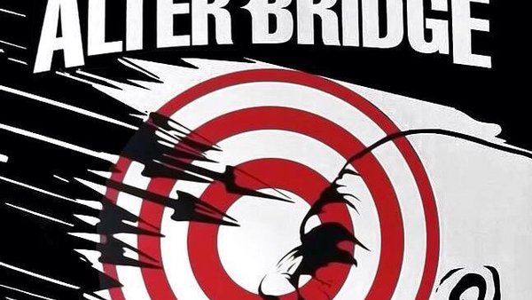
Alter Bridge: The Last Hero - 6 Things We Learned From The Cover Art
5. Logo Swap

The first thing I noticed on the new album is the change-up of the logo. It's slightly reminiscent of the direction Metallica went in across the late 90s, 'trimming' the more angular parts of their established logo for something more refined and wider-reaching.
The old logo is sure to make an appearance across future tours, as this new design is most likely part of The Last Hero's artistic presentation. Still, as of right now we have a slightly tweaked and 'cleaner' AB logo, and one that forms a good part of how The Last Hero 'feels' to take in.
If concept albums and visual showcases are something the band are heading into for the long-term (will each album have a different theme from here on out?), this could be a sign of more awesome logo-swaps to come.