5 Reasons Pushing Daisies Should Be Revived On Netflix
4. The Beautiful Colour Palette
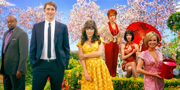
Pushing Daisies was renowned for its fantastic use of colour in all aspects. The tone and style was always very vibrant and quirky, like much of its characters and in being so really came alive on screen. Each character was always dressed to match their respective personalities in a tasty flourish that the show's art department really deserved credit for. Ned would always wear white or black to showcase his general bitterness and lackadaisical approach to life. Chuck would often wear flowery dresses because of her hippie-style free spirit personality. Olive who harboured long-gestating secret love for Ned, would oftentimes don green articles, not only because of her name, but also because of her constant envy of Chuck being the object of Ned's affections instead of her. Like many of the characters themselves, several of the locations in the show would be just as vibrantly coloured to brilliantly showcase the larger than-life style that Fuller was going for. Every bit of colour used whether it was a prop, costume, bit of makeup or general set design, fit seamlessly into the show. Every bit of this show was meticulously and painstakingly put into great care of detail, and that hard work on the part of the art department needs to be recognized once again.
Philip Clarke is a 21-year old graduate of the SAIT Film and Video Production Program. He spends his days working on his novels and feature film screenplays. His favourite film is GoodFellas. He goes to the theatre to watch movies on a weekly basis to feed his cinematic addictions.