16. The Title Sequences Are More Detailed Than You Thought

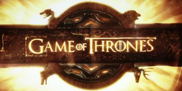
Oftentimes, there's a reason why you win the Emmy For Outstanding Main Title Design. The titles count for a lot when you first start watching a new show if they're lacklustre, you're more inclined to switch off. Therefore, a lot of shows tend to put substantial amounts of elbow-grease (no, not literally, I don't think such a product exists) into them. Yet even so, Game Of Thrones' opening titles dwarfs the competitors, providing you with the ass-ton of detail needed to get a handle of Martin's universe. Most of this is blatant the glowing orb at the start, bedecked with a wolf, a stag, a lion and a dragon represents the conflict between the major houses, the cogs and wheels are reminiscent of political machinations (they're originally based off Leonardo Da Vinci's inventions) and the locations the titles visit as they swoop across Westeros and Essos differ with each episode's settings. Yet it's when they start getting into more detail that Elastic who also designed the titles for fellow HBO shows Rome, Big Love and Carnivale start to show how much detail they're putting in. You might notice that whenever you see an actor's name come up on the sequence, there's always a bit of decoration around the words. This isn't just there to look pretty if you look closely enough, you'll notice that Westeros' house sigils appear beside these titles. So when we see Charles Dance who plays Tywin Lannister we'll see something vaguely lion-ish, which looks very different from Richard Madden's Robb Stark, who'll have a wolf. With such tidbits apparent, it's a wonder they don't just give the Elastic crew the titles prize every year.
 Oftentimes, there's a reason why you win the Emmy For Outstanding Main Title Design. The titles count for a lot when you first start watching a new show if they're lacklustre, you're more inclined to switch off. Therefore, a lot of shows tend to put substantial amounts of elbow-grease (no, not literally, I don't think such a product exists) into them. Yet even so, Game Of Thrones' opening titles dwarfs the competitors, providing you with the ass-ton of detail needed to get a handle of Martin's universe. Most of this is blatant the glowing orb at the start, bedecked with a wolf, a stag, a lion and a dragon represents the conflict between the major houses, the cogs and wheels are reminiscent of political machinations (they're originally based off Leonardo Da Vinci's inventions) and the locations the titles visit as they swoop across Westeros and Essos differ with each episode's settings. Yet it's when they start getting into more detail that Elastic who also designed the titles for fellow HBO shows Rome, Big Love and Carnivale start to show how much detail they're putting in. You might notice that whenever you see an actor's name come up on the sequence, there's always a bit of decoration around the words. This isn't just there to look pretty if you look closely enough, you'll notice that Westeros' house sigils appear beside these titles. So when we see Charles Dance who plays Tywin Lannister we'll see something vaguely lion-ish, which looks very different from Richard Madden's Robb Stark, who'll have a wolf. With such tidbits apparent, it's a wonder they don't just give the Elastic crew the titles prize every year.