10 Best WWE Set Designs
9. SmackDown (1999 - 2001)
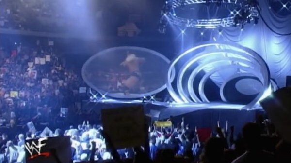
The pitch meeting for how to style SmackDown is almost too easy to imagine for its own good.
"Okay, we got Raw on USA! RAW IS WAR! It's RAW like my sexual energy. It's angry furious red, like my face when I'm lifting! It's jagged, like Linda. How can we give UPN something totally different for this brand new show? What do we have what do we have?"
One terrified executive peers around the Stone Cold Steve Austin flask they'd been hiding behind:
"Blue?"
Another terrified executive finishes wiping the ketchup and steak flakes from McMahon's dimpled chin:
"Oval?"
"I LOVE IT! GODDAMN, AM I A GENIUS FOR INSPIRING YOU OR WHAT?!"
Still, like everything else in the company's transcendent 1999, it worked an absolute treat. Instantly creating a little bit of fresh air between the two shows, the different scheme set the brand apart as something just as hot as Monday Night Raw without needing quite as much fire and fury in the iconography. The Rock often claimed the show as "his", and there was something to that - it was temporarily the much cooler younger sibling to the grandiose flagship.