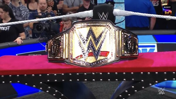
4 Ups & 5 Downs From WWE SmackDown (June 2)
1. That “New” Belt

OK, so this writer didn't see the issue when folks were bitching that the World Heavyweight Championship design over on Raw. Yours truly actually kinda liked it, but this "new" Undisputed Title look on SmackDown doesn't get the same pass. It's a lazy colour palette swap yet again.
It was obvious that WWE hadn't bothered to change the belt's shape or general feel even before Triple H pulled the cloth off to reveal it. Does anyone else agree that the company missed a golden (ha) opportunity to do something fresh here? That title design has been screaming for an overhaul, man!
Fans didn't get one on Friday.
WWE switched out the black/red/blue backing behind their logo in the centre plate for gold and called it a day. Worse, certain camera angles and overhead lighting made the belt look p*ss-stained yellow. That's not a compliment.