7 Improvements The WWE Network Badly Needs
5. A Totally New Dashboard
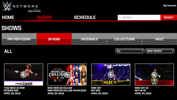
Four/five years on, the Network's dash is creaking a little.
Don't get us wrong, it's not terrible, like at all, but it is rather clunky at some points. This is especially true is one happens to be using the dreaded PS4 app. There, manually sliding through pay-per-views from a specific event is tedious. There's no option to sort by year, and users are bizarrely forced to slog through a slideshow menu rather than quickly pick what they want.
The whole aesthetic could do with an overhaul, to be honest. Though things aren't as bad on desktop computers, it's still true that the Network dashboard looks and feels archaic at this point. This is where WWE can take inspiration from switched-on services like Netflix. They periodically hit the refresh button to keep things appealing.
Suggestions include adding the ability to categorise and filter results onto the console apps and/or eliminating the current one-by-one style of browsing. What's the harm in showing more pay-per-view thumbnails on screen at once?