AEW Dynamite's New Look Is Very WWE...
LED boards and videos comprised the bulk of AEW Dynamite's aesthetic makeover last night.

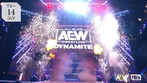
AEW debuted Dynamite's long-awaited new look on last night's show, unveiling a new set design that edged the Tony Khan-helmed promotion closer to WWE in terms of presentation.
The show's 'Light the Fuse' theme remained, albeit in remixed form, with the opening video package reminiscent of recent social media teases with its black background and red and blue lines. Cutting to the arena, a large stage comprised of several video walls was unveiled, resembling a less grandiose version of those deployed by the market leaders.
Gone were the entrance tunnels that had given AEW distinction since Dynamite's October 2019 launch, though there were still two sides from which wrestlers could enter. Unsurprisingly, Cody Rhodes' elevator also bit the dust.
While not a complete overhaul, Dynamite's new set looked cleaner and slicker than its predecessor. Whether this is a good or bad thing is in the eye of the beholder.
This was AEW's first significant aesthetic shake-up since the promotion was launched in 2019. Aside from a few minor tweaks here and there, the televised product had not undergone such a transition, though the new set didn't have a huge impact on Dynamite's overall feel.