Ranking Every WWE SmackDown "Throwback" From Worst To Best
6. Logos And Match Graphics

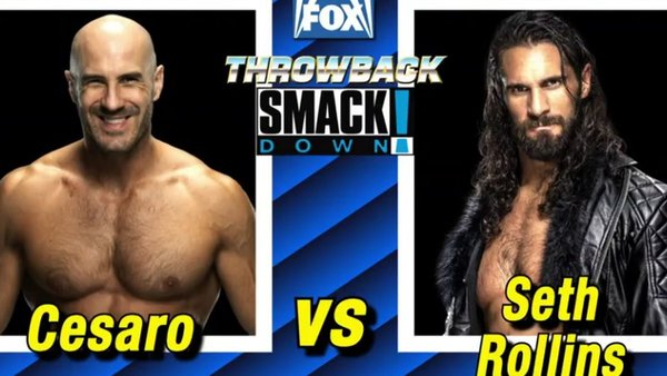
In another nice-touch-tinged-with-stupidity, last night saw the return of the SmackDown! logo of the early 2000s for everything from the opening signature to the little branding WWE uses on its YouTube clips of the show. But then WWE went and pointlessly muddied the waters once again.
Instead of having the various match graphics, highlighting upcoming contests on this show and next week's edition of SmackDown, be sold in the style of say a 2006-esque moving image of the stars set to clash, another '80s-style alternative was used... for a show which debuted at the end of the '90s. Makes sense. This also applied to the graphics showcasing a talent's name as they made their way to the ring.
It's almost like those in charge had no plan whatsoever coming into last night and just splurged whatever imagery they associated with the word "retro" onto our screens. The lack of cohesion in the type of "Throwback" this night would be unfortunately made what could have been a lovely dose of nostalgia into a unexpectedly jarring experience at times, and the use of mis-matched graphics and logos highlighted this perfectly.