10 Amazing Comic Book Redesigns That Didn't Last
9. Batman Incorporated

One of the biggest question that'll always divide Bat-fans straight down the middle (apart from how long the ears should be - it's short, btw), is what colour the character looks best in. We've seen variations of black, grey and blue, and it's all punctuated by the symbol on his chest.
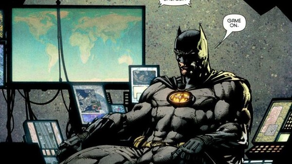
For the past two decades, the plain old black symbol has been the standard uniform of the Dark Knight, while the years before saw him adopt a yellow crescent to fall behind the bat. It marked a comeback in Batman Inc., in a suit designed by David Finch, and it proceeded to last a grand total of a year before falling to the wayside in the New 52.
The Inc. suit is the best of both worlds, marrying the darker coloured Batsuits of the modern age with the classic vibrancy of the character's older comics. It was the perfect union, possessed symbolic value in terms of Batman's mission coming out of the shadows, and just looked the part in general.
If only it was around for longer...