8 Biggest Things To Come Out Of Doomsday Clock #3
7. Batman Has A New Redesign

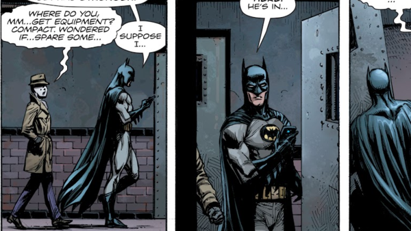
While Batman has his old threads on the cover to Doomsday Clock #3, he's sporting a new design in the actual comic itself. Throwing back to designs we've seen in both Earth One and Batman Inc. previously, the new look is a nice change over Rebirth's initial design, which was itself also stunning.
Gone is the purple underlay to the cape, and in its stead has come the grey and blue of the character's classic garbs. It's a nice throwback to the character's early days, and while the Rebirth suit was pretty great, it's nice to see DC spice up their designs periodically, especially when they look as good as this.
The design change might also lend itself well to Johns' narrative. The DCU, while increasingly temperamental in its current state, is far brighter in comparison to Moore and Gibbons' Watchmen world. The yellow symbol, then, takes on a whole new level of importance altogether, with the original design having derived from DC's silver age of comic books.
This isn't to say that Batman's any brighter in this reality, but compared to Watchmen, Bruce is a saint. How fitting he has the suit to match that reputation.