Convergence #6 Review: 5 Reasons Why It's A Mediocre Step In The Right Direction
2. Fancy Framework
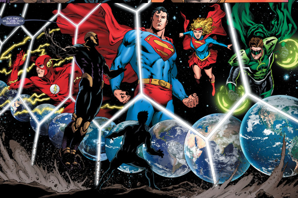
Artwork in comic book events has to toe a delicate line between the grandiose and the modest. These stories tend to have massive casts with vast, sprawling settings; smaller panels devoted to character moments must always temper the visual communication of extravagance lest characters get lost in the scramble. Here Benes and Pasica succeed completely. Using the hexagon-panelling motif found in earlier issues, Benes and Pasica manage to create a sense of magnitude while highlighting individual characters. They also use this technique to visually reference Crisis on Infinite Earths as you see an infinite number of earths sweeping across the hexagon frames. By making this allusion, the art reinforces the size and potential importance of this event. Convergence #6 also makes great use of two-page spreads, delivering widescreen, cinema style panels usually during action sequences that emphasize the scope of the narrative. Similarly, when the narrative slows down during character moments, Benes and Pasica use single pages, allowing the reader to focus on the specific characters in light of the bombastic events that frame this issue. This artistic method of contrasting big and small moments using spreads and single pages is perfect for a massive blockbuster event like Convergence, allowing characters to shine amid the large-scale events of the narrative.
Since childhood, Bryant has been an avid fan of superheroes, and he has been reading comic books since 2006. His full name is "George Bryant Lucas"; however, after enduring countless Darth Vader jokes, he has chosen to go by his middle name. Born and raised in the United States, Bryant is currently living with his lovely wife in the country side of Wiltshire County, UK. Bryant does suffer from a mild case of dyslexia; misspellings and homonyms are to be expected on occasion.