14 Simple Fixes That Would Have Made Fantastic Four Awesome
3. Stick To The Traditional Dr. Doom Design
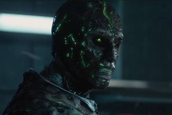
Another huge complaint from the second those behind-the-scenes images showed up is that the character design for Dr. Doom (or merely Doom as he's called here) is, well, terrible. Doom just looks like a blandly generic, robotic villain without any personality, he only wears the hood for the last few minutes of his screen time, and simply, will practically have you begging for the widely-ridiculed attempt from the previous F4 movies. It's a massive waste of Toby Kebbell's talent that he was saddled with such a terrible interpretation of the character, all the more so when it would have been zero effort at all to just stick relatively closely to the original comic book look of the character. But no, in the pursuit of something "grittier" and "darker", this Doom has to cast aside convention and opt or something that basically pleases nobody. All fans want is something that looks approximately like the Doom they know and love. It can be a little bit different, but it just needs to look cool. Given how bada** Dr. Doom already looks in the comics, and how easily it would translate to live-action (he ain't exactly Apocalypse!), why bother screwing around with a classic at all?
Stay at home dad who spends as much time teaching his kids the merits of Martin Scorsese as possible (against the missus' wishes).
General video game, TV and film nut. Occasional sports fan. Full time loon.