Joker Trailer 2 Review: 9 Ups & 3 Downs
6. The Look Of This (Scorsese-Influenced) World
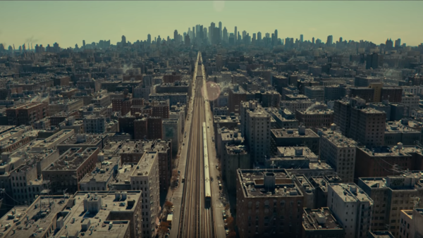
If you're a Scorsese fan and you got some serious nostalgic flashbacks during the trailer, it's clearly no accident. This entire project has been presented as a love letter to the director from the outset and Robert De Niro's presence is like the cherry on the cake. But even away from his casting and the Taxi Driver feel to Arthur's arc, the film LOOKS like it could have been set in a world built by Scorsese.
The colour pallettes, the lighting and even specific shot framing look like someone has been studying his work. You get sepia-toned neighbourhood environments (which look like incredibly good reflections of the 1970s) but then just as Scorsese is fond of doing, you get vivid punctuations of colour.
Famously, Scorsese is a fan of using red liberally, sometimes soaking entire screens in it and though it's a little more subtle here, the same commitment to colour runs through the trailer - mostly in cold blues, but also a spectrum of others. It's very clear that colour has been adopted the same way Scorsese uses it.
And on top of all of that, the cinematography looks insanely good.