Why Modern Movie Posters SUCK
The Magic Of The Movie Poster - What We Had (& Why They Changed)
Nostalgia and cinema can prove an intoxicating combination, and there is a danger when looking back at the history of poster art that we oversimplify the past and minimise the merit of more modern works. We are all a product of various inputs and stimuli and from that we form synaptic connections with the art we encounter. By that I mean, yes, Tangen's work on 2004's Spider-Man 2 is beautiful and iconic, but it holds a unique place within my silly zillennial brain as that film was also a touchstone of my early aughts childhood. The same will doubtlessly be the case for the generation of film fans who have come of age in the 2010s and 2020s, many of whom will also be looking to catch the same elusive phantom Scorsese conceptualised in his earlier reflections.
Regardless of method, movie posters advertise as much as they capture a moment in time. They recollect a feeling - a vibe. But some vibes are cooler than others, and by that same token, it's important to acknowledge that changes have taken place - and not always for the better.
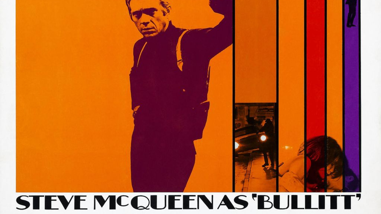
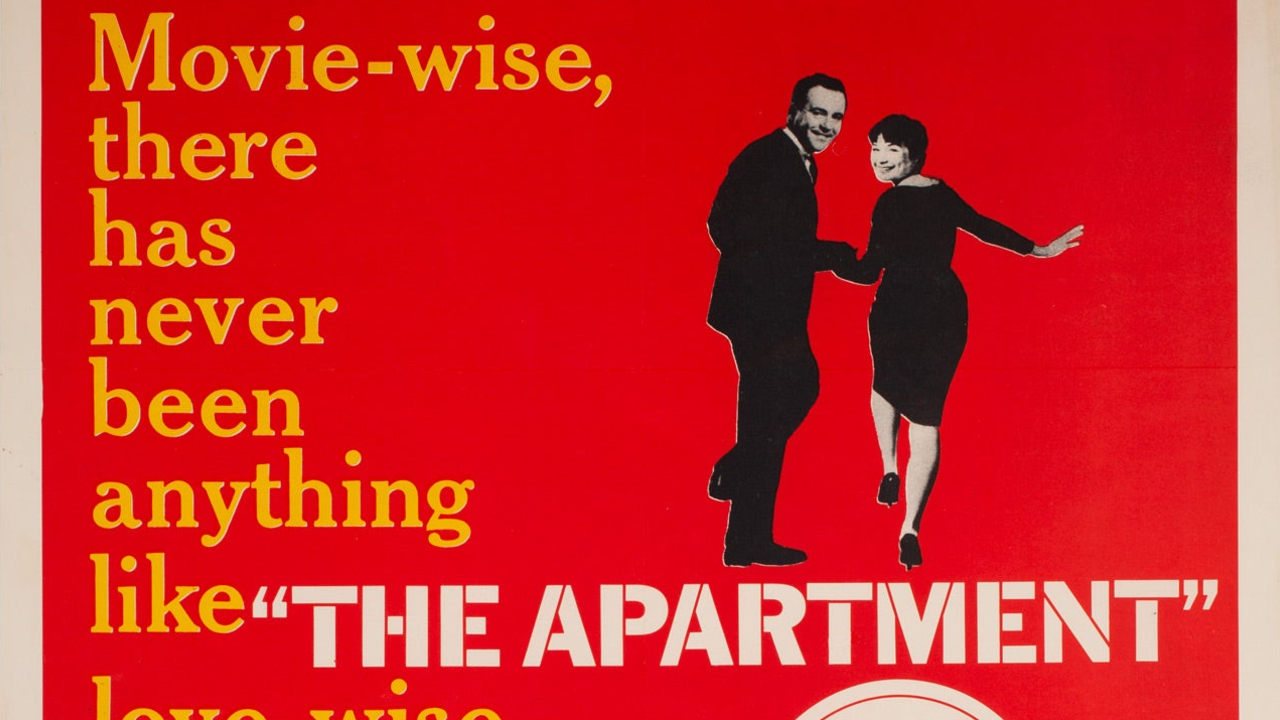
Trends have long guided the art form, but repetition, say, 60 years ago, largely adhered to more expressive and abstract currents, with movements like pop art and minimalism cultivating a more vibrant spectrum of one-sheets and quads. A photograph or painting of a star could sell a movie, but said star power could be harnessed in a variety of ways, whether to invoke their cool factor and sex appeal - as with the above one sheet for the Steve McQueen-starring 1968 thriller Bullitt - or to complement the overall tone and spirit of a picture, exemplified in the simple but flurouscently striking poster for Billy Wilder's The Apartment, which features a playful Jack Lemmon and Shirley MacLaine off-centre at a distance, set against a scarlet background.
Forming an even greater contrast with the blockbuster posters of today are those that adhered most closely to minimalist influences. Saul Bass was a pioneer in this regard, with his posters for Vertigo, Anatomy of a Murder, and The Shining capturing the disorientation, peril, and terror of those respective films without the need for stills at all. Similar legendary examples of posters made in this tradition include Roger Kastel's Jaws one sheet and Philip Gips' designs for Rosemary's Baby and Alien - posters laden with stark, fierce, and evocative imagery, each conjuring feelings of dread in all its subtle undercurrents.
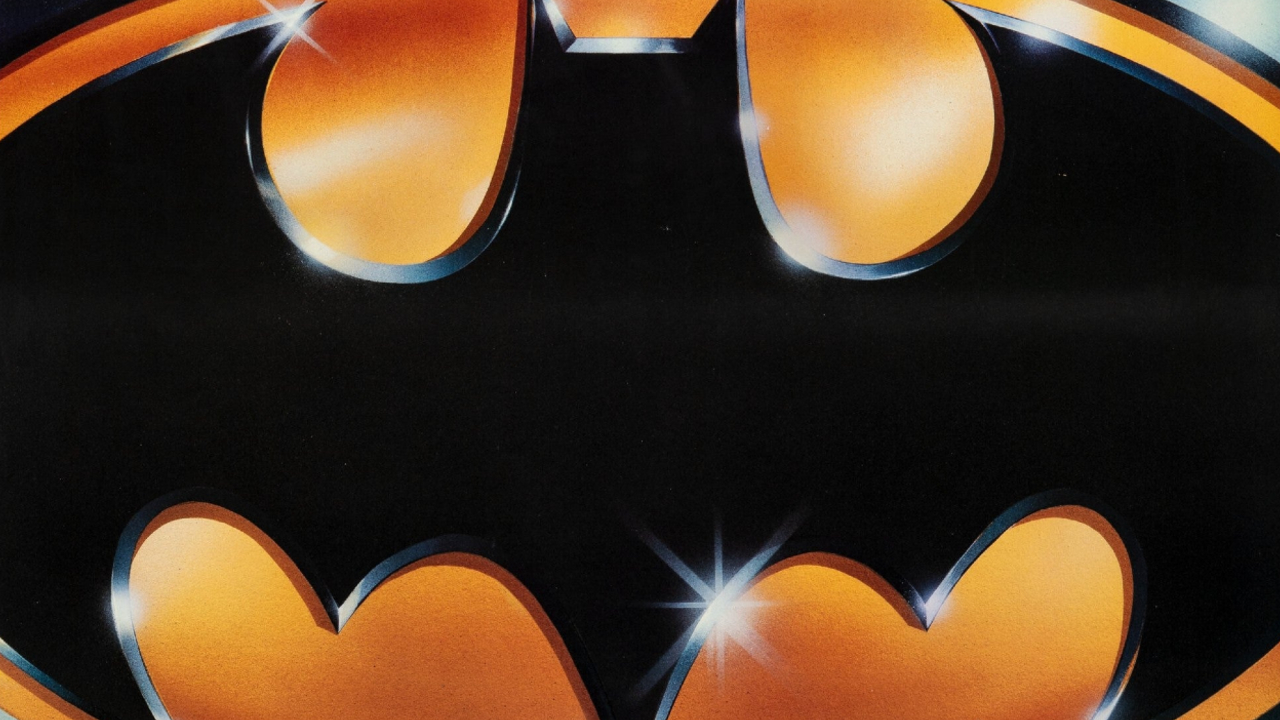
Contextually, this trend of graphic experimentation was influenced by the creative freedom afforded by the American New Wave and the shifting approaches to star power and studio politics that accompanied it. Even then, however, when Hollywood returned with a vengeance in the 1980s, poster design largely remained expressive and gutsy. This was the decade Struzan burst onto the scene with iconic posters for John Carpenter's The Thing and Lucasfilm's Return of the Jedi. Warner Bros., meanwhile, developed a commercial phenomenon with 1989's Batman, and the defining advertising image was a logo set against a black backdrop. In this case, it was the very absence of specificity that generated anticipation and intrigue, a creative flex which spoke to the larger-than-life appeal of an inimitable medium.
This isn't to say, obviously, that every poster historically has been a hit and that we've only recently experienced a sudden drop-off in variety and expression, but rather that the environment for blockbuster filmmaking even in the commercial context of the eighties was more adventurous. Even at their most conservative or garish, posters could still feel painterly or somewhat authored. As much as it pains me to pay a compliment to Ron Howard's The Grinch or Santa Claus 3: The Escape Claus, colour blocking and image composition were clearly scrutinised during their design (terrifying as Martin Short's Jack Frost might be to look at). There is no reason that a Marvel movie as big as, say, Shang-Chi and the Legend of the Ten Rings, should be so washed out and anonymous by comparison.
For the last six-or-so years, the Mouse House's superhero studio has been by far the biggest offender for uninspired film posters. Avengers: Infinity War and Avengers: Endgame were criticised for their head poster-isms but they at least had strong, recognisable colour pallets. Compare them to the posters for Ant-Man and the Wasp: Quantumania or Captain America: Brave New World - both also ensemble films, but with posters way more sludgy-looking - and the lack of invention is clear to see.

Said contrast is exacerbated when you compare Marvel's posters with the competition - namely, the crimson stylings of Matt Reeves' The Batman or the kaleidoscopic tones of James Gunn's Superman - and then blown up to dispiriting levels when you look into the company's own past. The difference in artistry and intrigue between Tangen's Spider-Man posters and those designed for Spider-Man: Homecoming is night and day - the former boasting a gorgeous combination of dusklight imagery and reflective peril, and the latter having a smattering of actors placed haphazardly against a generic New York City skyline. One is inspired. The other is tired.
More than just laying bare Marvel's modern-day shortcomings, the posters for the Tom Holland Spider-Man films also illustrate an overall flattening of blockbuster aesthetics in the digital age. For Marvel specifically - where a house style is carried across from script to screen - it feels emblematic of a lack of creative endeavour, but in regards to the industry's wider evolution over the last two decades, it also encapsulates everything from studio anxieties to contractual quirks and the ever-shifting landscape of digital advertising. There are a lot of pressures being exerted all at once, and for the biggest movie franchise on the planet, the consequences have been felt most acutely.
[Article continues on next page...]