Why Modern Movie Posters SUCK
Movie Posters Today - A Narrow Landscape Punctuated By Occasional Brilliance
For painted posters specifically, their decline may also be attributed to the ephemeral nature of theatrical runs and the relatively nascent lifespan of cinema as an art form. In a piece on his personal blog titled "The Lost Art of Painting Posters", author Christopher Fowler recounts his own experiences working as a writer for a UK-based advertising agency early in his career, in which he saw dozens of painted posters for films made under the Rank Organisation banner shunted straight to landfill - a fate that reflected the lack of recognition British poster artists received for their work and for the art form more generally. Rank collaborated with legendary British auteurs like Powell and Pressburger, Carol Reed, and Alfred Hitchcock, but here were the physical remnants of their legacy being broken up and destroyed as if they were scrap.
Fowler's anecdote also seems to offer a partial explanation for why illustrated poster art declined in the latter half of the 20th century. "By the time we started our own film marketing company", Fowler explains, "photography was replacing artwork, actors were seeking image approval, and artists' interpretations were no longer wanted as Hollywood tightened its control on copyright.”
Photography is expeditious to the deadlines and demands of a commercial industry, and to that end, it's no surprise that painted poster art has fallen to the wayside in the way it has. Hollywood continues to undermine and undervalue artists from the conceptual stage of development through to graphic designers, animators, and every human element in between, a long-term trend now exacerbated by the encroaching influence of Big Tech and the implementation of generative AI in studio workflows. It's an attitude that filters down to studio archives as well, with box art on home video releases outside of the boutique labels like Criterion and Arrow Video defaulting to bland digital compositions that flatten texture and erase the vibrancy of past aesthetics.
Again, this isn't to diminish the beauty of photographed or digitally-composed posters, or to argue that painted posters are a one-size-fits-all solution. Their decline does, however, feel emblematic of industry neglect towards the disparate human components that each form a pillar of the cinematic experience, as well as a potential lack of faith in audiences to extrapolate a vibe or meaning from a piece of art.
Of course, abstract or minimalist art will not meet the needs of every film, whether due to those previously mentioned external pressures or simply because they don't evoke the right spirit or mood for a given project. Sometimes, given the nature of how we as a prospective audience interact with marketing in the digital age, the most clear and concise method can also be the most appropriate.
It's a high-wire balancing act that Kemp draws attention to in her piece for Letterboxd, concluding from her conversation with Ahi Films' Courtney Mayhew that the art of movie poster creation doesn't so much lie solely in artistic appeal as much as it does - and I love this - the act of "finding gateways for people to connect with the art of film". There isn't a one-size-fits-all approach to the craft, and given the breakneck pace of digital advertising, it makes sense that certain design tropes have become entrenched for studios more anxious than ever about cinema attendances and box office turnarounds.
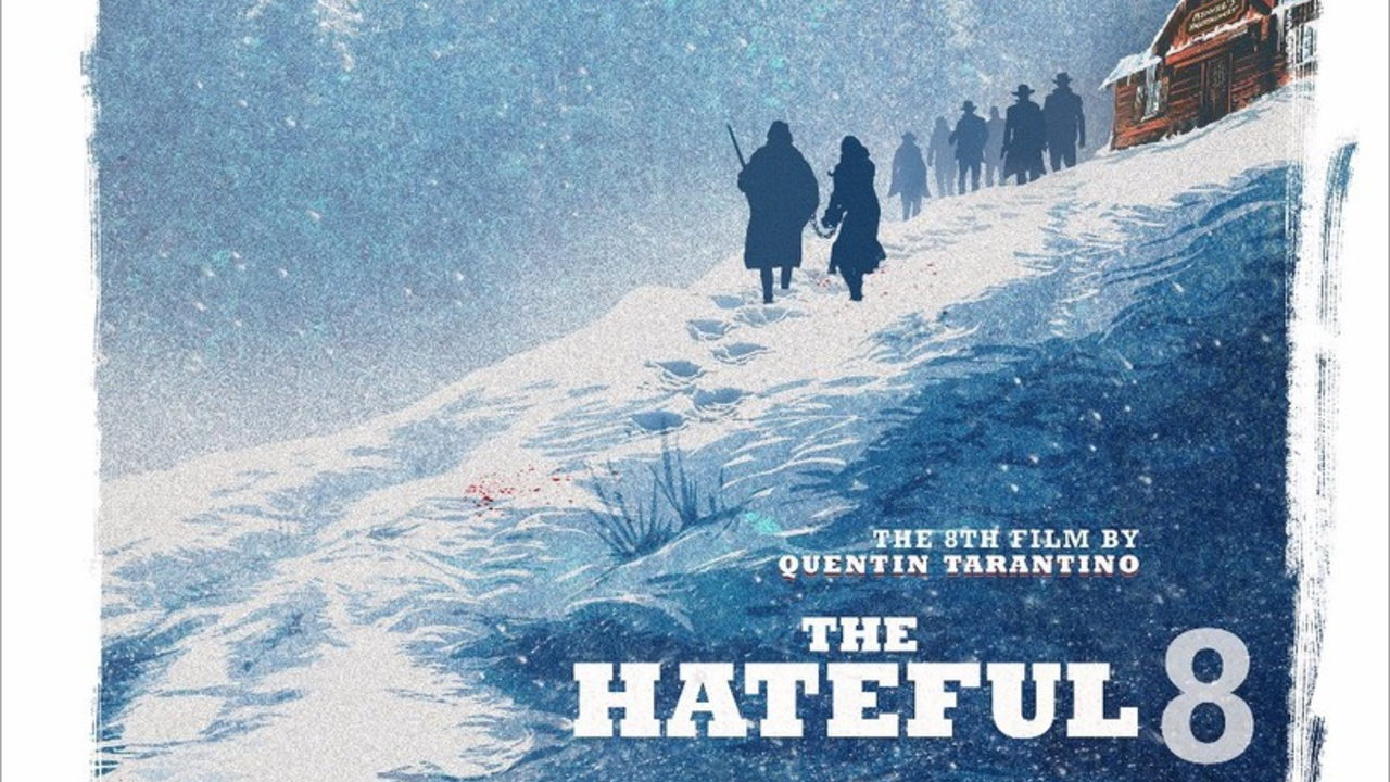
It is also true that a movie's marketing doesn't just begin and end with one poster. Quads, character one-sheets and the occasional complementary abstract teaser may all be commissioned depending on the size and scale of a given project. For Quentin Tarantino's The Hateful Eight, this meant both a painted teaser poster and a more high-profile photography-based campaign that emphasised the star power of its ensemble cast. The former arguably succeeded best in conveying the paranoid atmosphere of Tarantino's Western, but the latter would have played a valuable role in evoking its blizzardy imagery and star-studded credentials, whilst also avoiding the pitfalls of a Disney-style floating head collage.
Given the space to cook, then, modern movies can still be given an iconic poster - and if we look away from the big tentpole studios to small and mid-budget works, the success rate for banger artistry increases. Robert Eggers' Nosferatu remake had not one but two brilliant main posters that obscured its leads' features, all while the film itself went on to claim a mighty $181 million haul at the box office. Seventies throwbacks Licorice Pizza and The Holdovers each received one-sheets that mirrored the illustrative and abstract trends of the decade's aesthetics, while cult favourites like David Lowery's The Green Knight and Zach Cregger's Barbarian utilised striking minimalism and a primary colour palette to equally great effect.
[Article continues on next page...]