Why Modern Movie Posters SUCK
Good Movie Posters Haven't Left, But The Phantom Isn't What It Used To Be
While there's clearly still plenty of beauty in the movie poster medium, then - even in those studio tentpoles that feature head collages most prominently - there's also an issue in that the scope for the abstract and expressive has narrowed as studio trust in audiences has diminished.
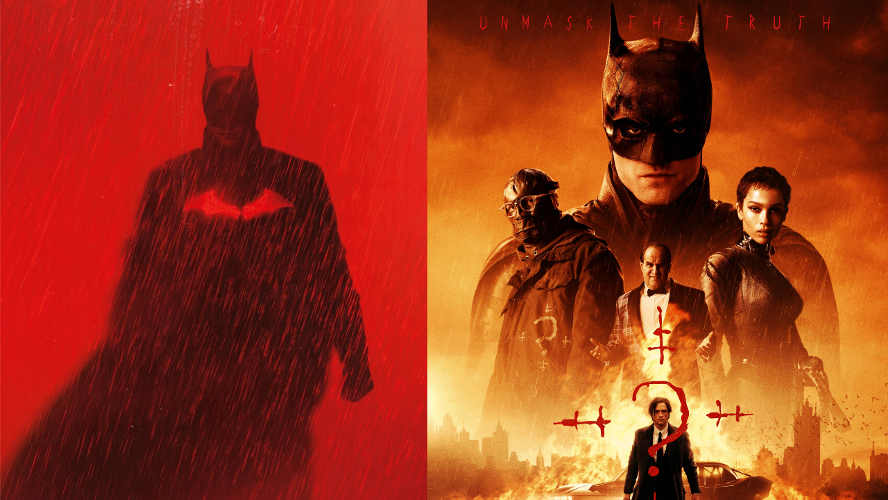
In 1989, Warner Bros. believed in the Batman brand strongly enough to sell an entire film on a logo and the names of its two leads. In 2022, the studio started marketing its latest Batman film - Matt Reeves' The Batman - with a series of gorgeous, blood-red, minimalist one-sheets, before capitulating to trend and taking the floating collage route months before the film's theatrical release. It's not unusual for a blockbuster to take a multipronged approach with its poster marketing today - combining big one-sheets with individual character posters, for instance - but in this case, The Batman demonstrates quite neatly the insecurity of our current filmmaking context.
As the years have progressed, the Dark Knight has appreciated into an even greater asset than ever before, and at a time when studios are more protective of their intellectual property. With that, naturally, comes added scrutiny. While Warner Bros. could market a new Batman film with a mixture of abstract imagery that evokes the spirit of the character in an artistically compelling and alluring way - as was arguably achieved by the aforementioned crimson posters - there's almost an anxiety that audiences will miss the point, hence the change in approach to the film's marketing.
Posters should, by their nature, tease and seduce by divulging information in one hand and withholding it in the other, but more often than not, they're crammed with as much as possible to cover the widest base, as is reflected in The Batman's theatrical poster, which did away with the red imagery of the film's initial phase of marketing. Robert Pattinson is a star with a huge following, so the poster needs to show him as Bruce Wayne. Penguin and Catwoman are both huge Batman characters, so they also need to be on the poster at the same time. The film features an unconventional interpretation of The Riddler, but rather than guard that revelation with an abstract tease, his costume needs to be shown brightly to clue audiences in on the change.
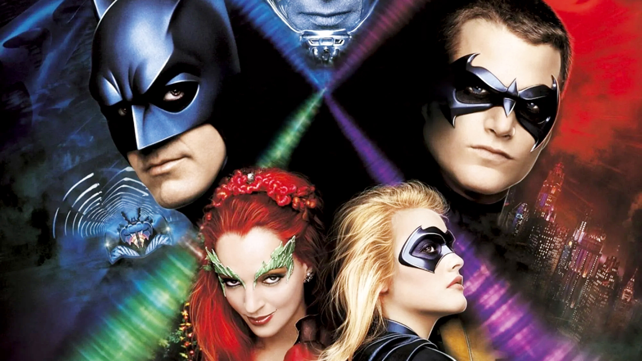
But really, the worst thing about the poster - and the thing that exacerbates its lack of ambition most of all - is its dull composition, which features every character standing head-on, static, and (barring Penguin) relatively stone-faced. Compare that to the collage posters for Batman Returns, Batman Forever, or even Batman & Robin, and the drop off in energy becomes even more jarring.
At the same time, while the contrast between the nineties Batman posters and those from his most recent film demonstrates that head posters can work, the overall space to experiment within those confines has been constricted. A convergence of contractual demands for actors to get their own slice of poster real estate, key art having to juggle an even greater breadth of merchandising, and an evolving digital advertising landscape leaves little wiggle room for experimentation. That isn't the case with every film released today - clearly not - but the lack of invention with certain blockbuster-budgeted projects does perhaps reflect studio frailties and the sense of disposability that accompanies a digital-first existence.
It's an extension of the physical media conundrum. The more audiences engage with media digitally, the less the totemic and ritualistic qualities of cinema - the act of walking through a lobby, or of purchasing a DVD, Blu-ray, or 4K and taking it home - come into play.
If the first and main way an audience engages with a poster has shifted from the cinema to a reel on Instagram or an advert on TikTok, the more that iconography develops into something transient and disposable. Posters today live fast and die young, whereas the quads and one-sheets of yore had decades to strengthen their roots in the collective pop-cultural psyche, providing a gateway during a film's theatrical run and then becoming fixtures as home media expanded in the 1980s and 1990s. For as much as it is the case that Hollywood has historically underestimated the impact and longevity of the painted poster, these pieces were able to develop venerated status through repeat exposure, thereby becoming the phantom we've kept trying so desperately to chase.
That may also apply to those posters that aren't as painterly or as interestingly composed as those developed by the poster artists of yore, but as the science of movie marketing has evolved - refined to the most acute detail with marketing research, engagement data, and so on - success is more easily quantified, patterns form, and the scope for experimentation diminishes, especially for those projects that have the most to lose, like a Batman, an Avengers, or a Star Wars.
Granted, this applies to just a portion of the movie industry at large - great poster art is there for those who look for it, whether from smaller studios or boutique physical media labels. In a way, it's an issue of exposure and prominence. There's a perception of modern poster art as lacking because the scope of blockbuster fiction has also narrowed in a post-MCU, post-pandemic world, where intellectual property is king, and reboots, remakes, and requels rule the roost. It would be dramatic to argue that this lack of endeavour has killed the phantom Scorsese spoke of, but perhaps, as far as the big studios are concerned, the desire to chase it has lessened just a bit.