Forza Horizon 4 Review: 6 Ups & 3 Downs
Downs...
3. The Long-Winded Interface & Loading Screens

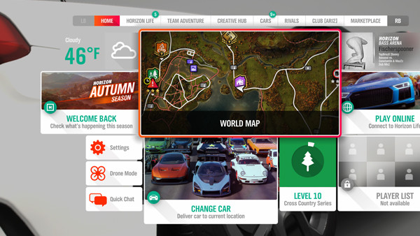
Like a lot of content-rich games, you can practically feel Forza Horizon 4 straining to keep its (mostly) well-oiled machine chugging along, resulting in the overall user interface and organisation feeling a bit clumsy.
Though the menus themselves look slick enough, manoeuvring around them can feel a tad sluggish, and it seems designed more for aesthetics than efficiency or simple ease-of-use. Considering you'll be spending a lot of the time in the game's menus, that's somewhat disappointing.
Worse is the sometimes infuriating loading screens, which can last close to 30 seconds for a race on the original Xbox One, to say nothing of how long-winded it can be getting a match going online.
There are also a frustrating abundance of glossy, unskippable splash screens transitioning between gameplay segments, which is clearly a not-so-subtle attempt to mask yet more loading screens.
The overall experience is absolutely worth the sometimes lumbering framework, but given the mind-melting scope of the game, it certainly would've benefited from favouring function over fashion.