Kingdom Hearts 3: 10 Hands-On Details You Need To Know
6. Massively Improved UI & Menus

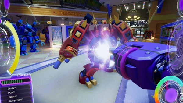
The User interface has received some very nice updates. The entire party’s health and magic bars are now together in the bottom right corner, and the bottom left corner menu now changes designs based on the world Sora is exploring at the time.
Clearly labelled prompts appear above the menu to let you know when your keyblade is primed and ready to transform. It’s very charming, and clean.
Advertisement