Shenmue III Review: 10 Ups & 6 Downs
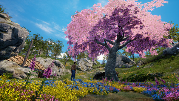
7. It's Secretly Beautiful

Early shots of Shenmue III rather worryingly depicted a plastic Ryo Hazuki, stiffly engaging with an anthropomorphised orange like something out of Toy Story. Though the fears over the game's visual competence were hugely exaggerated and unfairly reiterated on the basis of these very early teasers, no-one but the most ardent Shenmue adherent could deny that the animation and faces were just a little... shoddy. These were slightly unnerving signs.
Admittedly, the finished product's faces and animation are still a little janky by unrealistic 2019 standards, but outside a few overly exaggerated examples (who for some reason, mostly populate the opening area), everything looks just about right.
The environments are another story entirely. Squint a little, turn down the dimmer switch just a bit, and then, like one of those Magic Eye images, everything suddenly pops spectacularly. Both the verdant, pastoral plains of Bailu, delicately illuminated by flickering torches, and the bustling, electronic streetscapes of Niaowu look downright stunning.
Yes, the magic fades if you get too close, but a setting's beauty is defined by the bigger picture - not the individual bricks or blades of grass.