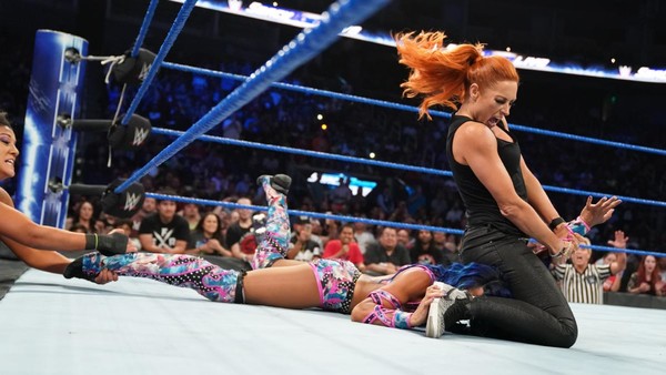
Why WWE SmackDown Looked Very Different Last Night
The blue brand had a noticeably different feel for its final USA episode.

SmackDown posted its very final edition on the USA Network last night, ahead of its big move to FOX Network next Friday, and regular viewers noticed things didn't look quite as normal.
They weren't just imagining things; the blue brand made a number of technical changes to production for the farewell episode, giving it an overall different feel.
Action was noticeably more cinematic, presented at a significantly lower framerate than the 60 FPS usually employed for live sports. Fans speculated this drop may have been down to WWE using new cameras, though industry insiders speaking with ComicBook.com have since attributed it to the way the live feed was encoded.
What this means is that the change in aesthetic was not intentional, and is unlikely to persist beyond this week's episode. In other words, WWE probably weren't experimenting with a new look ahead of their debut on FOX next week.
However, that's not to say SmackDown won't receive a huge visual overhaul when its premiere lands next Friday. A brand new logo has already been created for the blue show, and it's understandable that the new network will wish to stamp their own fingerprints on their billion dollar product.