10 Insane Lies Told On Video Game Box Art
These video game covers were lying to your face.

At its best, video game marketing finds artful and intelligent ways to convince customers that an upcoming new game is worth spending their hard-earned money on.
But publishers and marketing firms often resort to more nefarious tactics to drive sales targets, such as straight-up lying to players in both trailers and gameplay footage.
And sometimes this deceit will extend even to the game's cover art itself.
While on one hand this upfront subterfuge makes a certain amount of sense - after all, it's what people will see when they enter a video game store - it also serves as a permanent record of publishers telling barefaced lies.
These 10 video games, most of them ultimately well received by critics and players alike, nevertheless came to market with some flat-out bulls**t on their covers.
Often this artwork was otherwise gorgeous and eye-catching, but somebody somewhere felt that they also needed to dispense with some blatant misinformation to try and shift a few more units.
In some instances the game was worth being fooled, while in others those at the top were clearly trying to polish a turd...
10. This Isn't What Booker Looks Like - BioShock Infinite
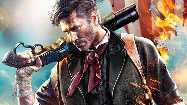
The front cover for BioShock Infinite may look pretty neat on its own merits, focusing on seemingly badass, chisel-jawed, gun-totting protagonist Booker DeWitt.
However, once you play the game and get to see what Booker really looks like, it's clear something far more cynical was at play behind-the-scenes.
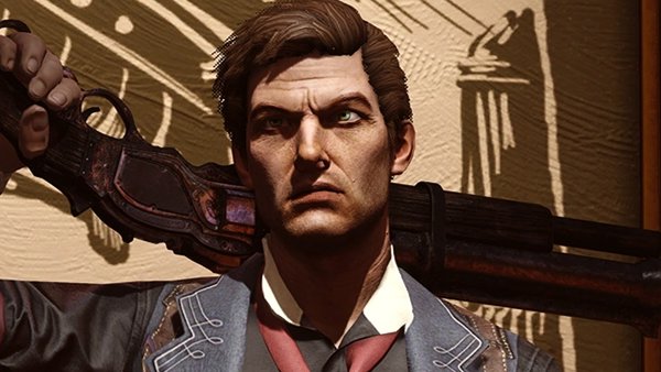
In the game itself, Booker looks considerably more "normal" - a pretty typical-looking man rather than the comparatively heightened hunk of testosterone that he appears to be on the front cover.
Though the cover doesn't fundamentally misrepresent the actual gameplay, it nevertheless feels like 2K wanted to appeal to edgy teens by making Booker look as tough and stylised as possible, while blatantly misrepresenting his actual design.
While it wasn't uncommon in decades past for cover art to be commissioned and completed before a game even went into full production, that excuse doesn't hold much water today.
9. Solid Snake Isn't The Protagonist - Metal Gear Solid 2: Sons Of Liberty

As most fans reasonably expected, the front cover for Metal Gear Solid 2: Sons Of Liberty featured one of Yoji Shinkawa's gorgeous drawings of franchise protagonist Solid Snake.
Meanwhile, the back cover proudly promised, "Solid Snake is back," and implied that most if not all of the game would see Snake attempting to infiltrate an oil tanker in order to prevent a weapon of mass destruction from falling into the wrong hands.
As incredible as Shinkawa's front design is, this box art is completely misleading, given that only the first hour-or-so of the game features a playable Snake, after which players are suddenly thrust into the shoes of the real protagonist, Raiden, who isn't featured anywhere on the box.
Fans remain intensely divided over the Raiden twist and how aggressively Hideo Kojima wrestled Snake away from them, but if nothing else Kojima committed fully to the lie from top to bottom, even asking reviewers not to give the big conceit away.
Thankfully Metal Gear Solid 2 is an incredible enough game that it's tough to feel too mad about the deception, though Snake was still sorely missed throughout.
8. "The Ultimate Bi-Level Battlefield!" - Mortal Kombat 3

The home console releases of Mortal Kombat 3 were largely well received, though some players nevertheless took umbrage with the fact that a promised feature didn't make the cut.
The game's back cover lists among its features "the ultimate bi-level battlefield," stating that players can "smash up and down into different backgrounds" during combat.
Though the final release does allow players to uppercut opponents into higher levels, there's no ability to move back down to lower levels or have any additional control over where the fights take place. If you reach the top, you're stuck there for the remainder of the battle.
Look, it's not the end of the world - certainly compared to some other entries on this list - but it's still staggering that the third entry into one of the most iconic video game IP of all time left such a brazen lie on its cover.
7. Using Screenshots From The Console Version - WWE SmackDown Vs. Raw 2007 (PSP)

"Bullshots" are nothing new in video games - developers have been upselling their games for literally decades with misleading images which inaccurately present a game's graphical prowess.
But THQ got particularly cheeky when it came to the PSP release of wrestling game WWE SmackDown vs. RAW 2007, which included two gameplay screenshots featuring Batista, Booker T, The Undertaker, and John Cena.
Except, to anyone with a pair of functioning eyeballs, it's clear that this level of visual fidelity simply wasn't possible on the handheld's hardware.
Basically, THQ had taken screengrabs from the PS2 and/or Xbox 360 versions of the game and just used them here, assuming people were too gullible to tell the difference.
The controversy over the deception was ultimately pretty muted, but it's all the more bizarre considering that the PSP version of the game was well-received by critics and didn't need to rely on such crass parlour tricks.
6. It's Not A Full Remake - Final Fantasy VII Remake

The biggest cover art controversy of recent times undeniably belongs to Final Fantasy VII Remake, which was criticised by numerous prominent gaming outlets for not clarifying that it was only the first part of a long-form remake project.
To look at the rather minimalist box art for the widely acclaimed RPG, you'd be forgiven for assuming it was a full retail remake of the entire original Final Fantasy VII, rather than an expanded reimagining of the first 30%-or-so of the game.
For people who don't follow gaming news and might just stumble across the game box, they'd be well within their rights to feel miffed when they find out they've shelled out a full retail price for only one-third of the game they thought they were getting.
It's a great, content-filled one-third, for sure, but all Square Enix had to do was simply write "Part One" underneath the word "Remake."
The back cover does actually mention that it's one part of a larger remake series, but it's printed in small, easily-missed text.
As such many believe Square Enix knew exactly what they were doing and didn't want to risk putting casual players off. At present it's still unclear exactly how many games the remake project will become, but it's certainly going to be at least three.
5. It Doesn't Feature A Man Playing A Banjo - Phalanx

Box art doesn't get much more ridiculous than that of the 1991 space shooter Phalanx, where an old man playing a banjo takes up a solid half of the front cover's real estate, despite having absolutely nothing to do with the game itself.
The more appropriate image of a spaceship meanwhile takes up just a small fraction of the cover and the tagline, "The hyper-speed shoot-out in space" is also tiny compared to the picture of the unidentified man strumming away.
Those who worked on the cover revealed in a 2017 interview with Destructoid that the unconventional design was a desperate attempt to differentiate the otherwise unremarkable shooter from the countless similar games on the market:
"We knew the game didn't have a lot to offer, but we wanted to make the package arresting...If we couldn't do anything else, we'd try and get the potential purchaser to stare at the package and try and figure out what just happened. Today it might be called a WTF moment. So [employee Keith Campbell] could have done some predictable spaceship shooting bulls**t that would have been like every other game out there.
Or he could create a story that would make people stop and think about it. And I guess it's proof that was a good idea because people are still thinking about it. Phalanx was a very average game with an unexpected cover design. It needed a great/weird idea to stand out from the crowd."
It's easy to appreciate the swinging-for-the-fences ambition of it all, but ultimately the strategy failed as Phalanx quickly came and went without much of a peep.
Believe it or not, obfuscating the actual nature of a game isn't a great way to part potential customers with their cash.
4. This Isn't What Mega Man Looks Like - Mega Man

In any discussion about the worst video game cover art of all time, the North American release of the original Mega Man inevitably comes up.
Though the gorgeous Japanese art reflected the title hero perfectly, the American cover was drawn in just six hours at the very last minute without a direct visual reference, and hoo boy, it shows.
Above all else, it just doesn't even begin to represent Mega Man correctly: here he's clearly an adult man rather than a boy, his costume is yellow-blue rather than his signature all-blue, and he's holding a pistol rather than having a canon fused to his arm.
Ultimately one of the game's artists, the legendary Keiji Inafune, blamed the terrible cover art on the game's shambolic commercial performance in the U.S.
Mega Man eventually became an icon in the west as in Japan, though, and the janky "Bad Box Art Mega Man" was later immortalised as a playable character in Capcom's 2012 beat 'em up Street Fighter X Tekken.
3. All The Missing Features - World Series Baseball 2K1

Back when Sega was trying to bolster their Dreamcast platform as a high-tech home for premium sports video games - particularly following the success of their universally beloved NFL 2K - they talked-up their upcoming baseball game, World Series Baseball 2K1.
Sega suggested the game would do for baseball what NFL 2K did for American football, delivering a comprehensive and visually stunning representation of the beloved sport.
But beyond the fact that WSB 2K1 was a shockingly lacklustre title from a visual perspective, it couldn't even deliver on the basics promised by its cover art.
The game's back cover promised the implementation of hot and cold zones to illustrate where players were most likely to hit the ball, dynamic weather systems, and four modes of play, none of which turned out to be true.
Beyond veering away from the promised sim-style gameplay, the absence of the much-loved home run derby mode first shown off at the previous E3 - and implied to be one of the four aforementioned modes of play mentioned on the back cover - left many fans understandably feeling duped.
Thankfully thereafter the license was taken away from WOW Entertainment and handed over to Visual Concepts - the team behind NFL 2K - who did effortlessly superior things with it.
2. "Better With Kinect" - Mass Effect 3

Though Mass Effect 3's colossally disappointing ending ensured fans couldn't talk about anything else for months, there was another, albeit far less-egregious controversy unfolding in plain sight.
The game's Xbox 360 cover art came with the boastful banner, "Better with Kinect," referring to the console's divisive motion sensing peripheral.
This allowed players to call out commands verbally during combat rather than carrying them out with the controller.
It was a novel idea and one that wasn't implemented terribly, but ultimately never rose above being a transparently desperate attempt to try and shift some more Kinects.
For anyone taking Mass Effect 3 seriously, talking to your console to issue basic squad commands wouldn't have improved the experience in any tangible way.
1. "Only On PlayStation" - Yakuza 0

A select number of PS4 games were released with the "Only on PlayStation" label on the front cover, obviously implying that these games were permanently exclusive to the PS4 and wouldn't ever be found on other platforms.
Though the majority of Only on PlayStation games have stayed that way, a number have since been ported to PC, and in the case of Yakuza 0, it's now available on both PC and Xbox One.
While additional availability is certainly a good thing for gamers in general, the banner boast does seem rather silly because true console exclusivity is such a rarity these days.
Furthermore, the physical release of Yakuza 0 still contains the exclusivity banner as Sega hasn't bothered to produce a new manufacturing run with the now-incorrect claim removed.
Again, there are far worse distortions of the truth on this list, but it does mean the front cover looks a bit daft to anyone who counts it among their collection.