14 'Genius' Video Game Features That Were Total Accidents
9. Kirby's Simple-Yet-Effective Character Design

What you think: Widdle, iddy-biddy Kirby was designed to be a simplistic, easily-loveable nostalgia-creator, his fuzzy and cutesy aesthetic being the result of a thousand different pitch meetings to create the perfect character for all ages.
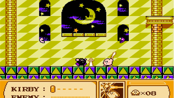
What actually happened: He was a total non-committal fluke, initially pegged as a placeholder character i.e. a quick doodle by Masahiro Sakurai put together for the sake of getting the game engine off the ground, the intent being to replace him with a 'proper' sprite somewhere down the line. Hell, his name wasn't even Kirby, it started out as Popopo (the parallel being antagonist King Dedede, who stayed to this day), but was changed to Kirby as a humorous spin on his aesthetic, contrasting against American lawyer Jack Kirby who Nintendo had past dealings with.
You can totally tell Kirby's entire look was the sort of thing you'd quickly scribble down in your notebook as a child - he's quite literally a round blob with a face, a smiley face come to life. That's what made him so immediately iconic; alongside hearing every art designer in the world slapping their forehead for not thinking of running with it sooner.