25 Greatest Video Game Box Art Of All Time
Window dressing at its finest.

They say you should never judge a book (or anything, really) by its cover, but sometimes that’s easier said than done. More often than not, the worst games have the prettiest covers – and the best games have the ugliest. So, how are you supposed to know what’s worth playing, if cover art is no indication of actual quality?
That said, cover art is meant to sell us an experience, sometimes overselling or exaggerating aspects which are uncharacteristic of that experience in order to enhance a game’s commercial appeal. Cover art can even help us neglect fundamental issues with a particular game that would otherwise be deal-breakers – and in the case of older games – provide crucial information not communicated through the game’s dated visuals, bringing the entire thing to life before our eyes.
It’s a difficult balancing act – most games falling flat on their faces, and others succeeding in tremendous fashion, capturing the spirit and personality of the games in question with tremendous effectiveness. As such, here are twenty-five examples of awesome box art that really screamed: "Buy me!"
25. Phoenix (Atari 2600)

Phoenix
– an innovative shooter, somewhat inspired by Space Invaders – features a
somewhat unrepresentative, yet arresting cover, illustrated by Burrell
Dickey, better known for his work on Centipede (1982). Aptly, it captures the spirit
of the game – albeit in exaggerated fashion – depicting a single, solitary
spaceship in combat with multiple enemies, and an enormous monument in the
distance looming over the entire scene, adding a much needed sense of dread, or apprehension.
Atari are famous for their striking cover designs. This is one of the better examples, but not the last to be featured on this list.
24. Castlevania: Symphony Of The Night (PlayStation)

Despite its simplicity, the original box art for Castlevania: Symphony of the Night is exceptional. In terms of composition, it's perfect - the protagonist prioritised, the image revolving around him, his sword eventually drawing attention upwards towards the castle, reflecting his eventual destination. It's arranged in such a way as to tell a very specific story, and it works well.
By comparison, the Sega Saturn version (shown below) is a little overindulgent, designed to reflect the additional content available in this particular version of the game, released exclusively in Japan. It's exceptionally detailed, sure, but overly complicated, plastering the entire image in random faces arranged in no reasonable way.

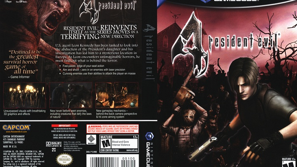
23. Resident Evil 4 (PS2)

Resident
Evil was reinvented significantly with the release of its fourth instalment, Resident Evil 4, which represented something of a hybrid, perfectly blending
the contradictory elements of survival horror with a more commercial
action/adventure gameplay. That said, it was a significant departure for the series, and therefore needed to
reassure players about the new change in direction.
Rather than be distracted by countless superfluous details, the illustrator instead emphasised two crucial factors: danger, and isolation, both of which represented longstanding conventions of the franchise. Instead of wasting time, it gives you everything you need to know, including a vague idea of a setting, and an allusion to a possible threat. It takes everything back to basics - unlike the GameCube version (shown below) which completely misses the point. (the PAL version was much more tasteful, more closely reflecting its PS2 cousin.)
22. Metal Gear Solid 3: Snake Eater (PS2)

Choosing
between these two examples was impossible. They’re each attempting something completely
dissimilar, and they're each achieving their ambitions splendidly, albeit entirely
differently. Honestly, it’s just a matter of personal preference. The European version
(on the right) is minimalist but effective, as well as completely eye-catching,
emphasising the central protagonist in striking fashion, stripping away
everything but the barest of essentials.
The North American version (on the left) is more eventful by comparison, but manages to encapsulate several core components of the gameplay and narrative, including the stealth, as well as the jungle setting – all without cluttering the image too excessively with superfluous details. In the end, it's up to you which does a better job.
21. Metal Gear (MSX2)

Speaking of Metal Gear... Hideo Kojima’s juggernaut franchise is responsible for some of the most memorable cover designs in gaming history, and the very first entry in the series is absolutely no exception.
In particular, the Japanese MSX2 cover art was especially effective, streamlining core aspects of the game into a single neat package, discarding every unessential detail – which is especially important for this particular series, considering how convoluted and downright incomprehensible the overarching story has become.
20. Demon Attack (Atari 2600)

One of the better selling games released in 1983, Demon Attack - a shooter reminiscent of Space Invaders and Phoenix - has since been mostly forgotten, which is surprising considering it features one of the more memorable covers ever released. I mean, it's downright unforgettable, featuring chrome dinosaurs strapped to rockets in space, which must be about as unapologetically awesome as you can get without breaking some kind of cosmic law.
Admittedly, I’ve never played the game, but this makes me think I’m missing out on something special, which is exactly the effect a great cover should have on a potential consumer.
19. Borderlands (PS3/360)

Borderlands – though not personally my thing – is undeniably brimming with personality, as well as imaginative characters and exhilarating action, meaning any attempt to recapitulate the experience would appear seemingly impossible.
That said, instead of just splashing the cover with gunfire and explosions in an insane celebration of mayhem, the illustrator took things in a different direction, deciding instead to depict a single character miming an act of suicide, blasting a supposedly hypothetical bubble of destruction across the remainder of the box. It's simple; it's elegant; it's captivating.
18. Half-Life (PC)

Half-Life
– the classic first-person shooter, released in 1998 – is patient, slowly
constructing a comprehensive universe in which the action could reasonably take
place. The result is a comparatively realistic shooter, prioritising storytelling
and atmosphere over mindless carnage, in which particular emphasis is placed on
the articulation of certain narrative themes.
Prior to its release, the genre was very much in its infancy, consisting entirely of loud, obnoxious shooters, desperately hoping to emulate the success of DOOM, or Wolfenstein 3D. As such, their box arts were fairly standard: muscles, monsters, and explosions. But those qualities don’t particularly capture the spirit of Half-Life, which was completely original in terms of visual aesthetic, narrative maturity, and technical execution.
Instead, the illustrators went with a plain metal surface, outwardly decaying from exposure to hazardous materials, thereby emphasising a sense of isolation, or entrapment – which makes sense given the majority of the game takes place in an underground facility, completely cut off from the outside world. It's simplistic, but effective.
17. Prince Of Persia (Super Famicom)

Spearheaded
by Jordan Mechner, Prince of Persia was heavily inspired by One Thousand and One Nights - an anthology of Middle Eastern tales compiled in Arabic between the 8th and 13th centuries – featuring stories such as Sinbad the
Sailor, Aladdin, and Ali Baba and the Forty Thieves.
In this respect, the game is a celebration of the mystic Mesopotamia, aiming to recapture the spirit of the stories without simply plagiarising their content. The cover (depicted above) is taken from the Super Famicom version of the game, and perfectly captures that same sense of adventures and mysticism, the spectacular illustrations accentuating these qualities ten fold.
16. Steel Empire (Mega Drive)

I’m
not a huge fan of overdesigned covers, but Steel Empire on Mega Drive might be the one exception to the
rule - specifically the version released
exclusively in Japan (ours wasn’t anywhere near as interesting).
It’s just so wonderfully detailed – and while some people may accuse it of cluttering the box – the arrangement of space is so meticulous, you’d be forgiven for barely noticing, especially considering how composed everything is within the image, intertwining seamlessly, never overshadowing anything else going on in the background. It's also really pretty, really, really pretty.