9 Disastrous Mistakes That Killed Star Wars Battlefront 2
1. Half-Baked UI Oversights Deny Usability

Bless DICE, they're always so close with their menu systems, and yet so far. So very, very far.
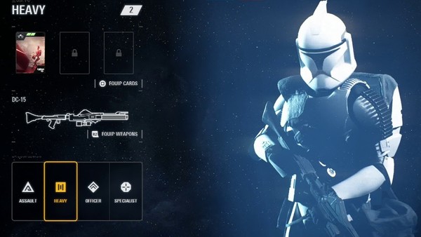
Fresh off the back of Battlefield 1's menu being a weird tribute to the Windows phone, we now have Battlefront attempting to be more minimalist, but dropping the ball in a number of key areas.
Things like not being told which map you're beaming into during consecutive matches (thereby not knowing which class or ability loadout you should use), not being able to claim rewards without quitting, barely having any idea how weapon attachments work and suffering terribly slow load times, it's all unnecessarily awkward to use.
Taken on its own, this wouldn't have stood out too much, but when the main menu itself had a typo ("Star Cars" instead of "Cards") for weeks and there are so many contributing factors to just engaging with the game, Battlefront 2 falls apart from a little to a lot on almost every level.