Battlefield V Review: 7 Ups & 4 Downs
2. The U.I. Is Needlessly Messy

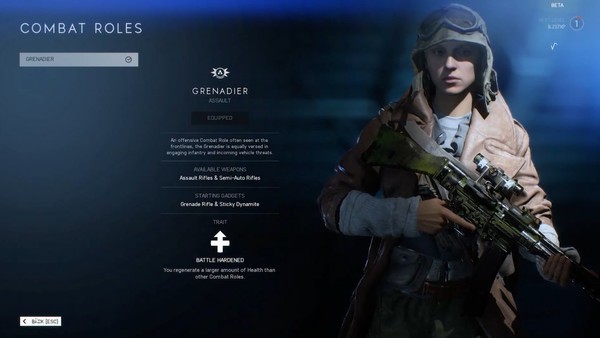
Although this might not sound like a big deal, it's kind of shocking just how much DICE continue to drop the ball when it comes to the user interfaces of each Battlefield game. With that said, their latest sequel might feature the most obtuse, most infuriating set of menus yet.
While the devs thankfully added in the ability to customise your classes in the main menu rather than mid-game (why they tried to insist on leaving this out is anyone's guess), actually altering these loadouts is unnecessarily time-consuming, forcing you to manually switch between Axis forces and Allies.
It's good that DICE included so many customisation options, but it's a shame they made messing with these options so finicky that you'll probably ignore them to get into the action that bit quicker.
This is all on top of them being sluggish as hell as well, with it sometimes taking longer to quit a match than to join one. It's frustrating to get so riled up over a bunch of menu screens, but them being so poorly implemented does impact your moment-to-moment enjoyment, and adds to the overall feeling that the game is undercooked.