Fire Pro Wrestling World PS4 Review: 5 Ups & 2 Downs
Downs...
2. An Awful Menu System

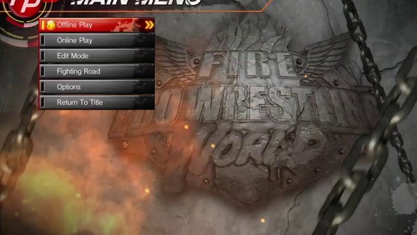
A rare cosmetic issue in an otherwise beautiful game, Fire Pro Wrestling World's menu system is an ugly chore to navigate.
Retro visuals are part of the series' charm. Thus, these menus can be forgiven for looking a little ramshackle, but functionality should absolutely evolve with time. It hasn't here, though: this is a clunky, unwieldy system that only serves its purpose in a frustrating way, and that's a shame.
This is a minor complaint, but it's something the developers can't be let off the hook for. Navigating back through the menu is the most troublesome part, as these particularly button presses aren't instantaneous, which will surely drive more impatient gamers around the bend. A lack of clarity as to what the game's various menu options actually do drags it down as well (no newbie could possibly know that 'Mission Mode' essentially means 'Tutorials'), though familiarity comes with time.