Metal Gear Survive: 10 Brutally Honest Early Impressions You Need To Know
9. The Visual Design Is Completely Uninspired
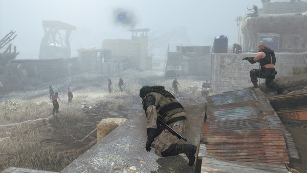
Unfortunately though, while the FOX Engine is capable of being a graphical powerhouse, the visual design of Survive completely ruins any potential beauty the game may have held. A quick look at gameplay footage released so far makes it immediately apparent that the shooter makes great use of a boring, grey/brown colour pallet, with a thick fog often rolling in to mask the repetition of the levels.
Predictably, early impressions seem to suggest that this vacuum of inspiration in the visual design continues into the rest of the game as well. Although the title is attempting to present an oppressive, almost post-apocalyptic landscape, there's no excuse for some of the more imaginative locales, like the all-white, Matrix-esque pre-game hub, from being so dull.
It doesn't make for an exciting environment to explore, and if anything, the murky colour palette only makes the stealth and action more frustrating as enemies unintentionally blur into everything else on screen.