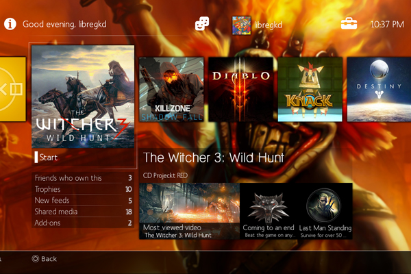
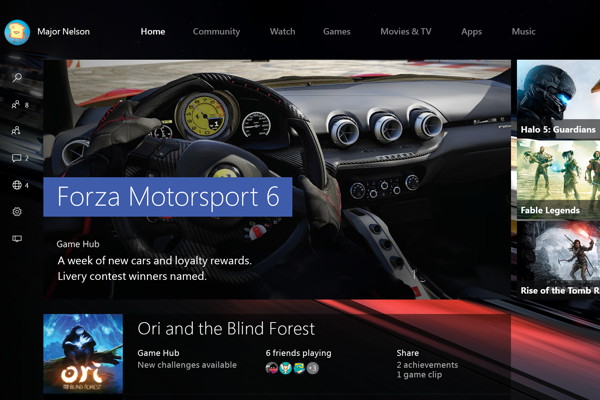
I've been holding off doing this article, mainly because the Xbox One finally got a much-needed upgrade in November, 2015, one that aimed to completely remove any semblance of the voice-commanding Kinect ever existing. Thankfully, it's mostly worked. The 'New Xbox One Experience' has been quite the hit with fans, reminding all of us why we used to love the Xbox branding and general presentation of everything so much. Games and multimedia options are presented in both horizontal and vertical scrolling fashion, putting your game library directly below where you log in, and having the Store or other apps off to the right. It's a neat idea, but still comes across a just that little bit too unnecessarily cluttered when put next to the PS4. Sony opted to keep their slick XMB from the PS3 days, doubling it into two horizontal feeds that have a row of apps and games on one, and your personal info, friends lists, settings etc. on the other. It's fast, responsive and you can instantly become familiar with where everything is. Point goes to... PS4 Microsoft just can't seem to resist forcing the Windows 10 tiled interface down everyone's throats, resulting in too many promotional squares and undesired screen real estate, ultimately making for a less pleasant experience by comparison.