Star Wars Jedi: Fallen Order - 10 Little-Known Details Fans Will LOVE
4. The UI Blends Perfectly Into The Original Trilogy's Aesthetic

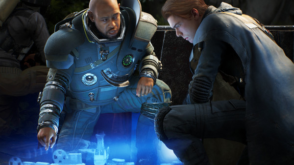
Illustrating Fallen Order's immersive qualities even further is the fact the game's UI actually blends effortlessly into Star Wars' aesthetics. What do I mean by that? Well, in most video games, if you were to open a map you'd probably have to hit pause, open up another menu, and access the map that way. Fallen Order does things differently though, by projecting a map out of BD R2-style in the familiar blue tones of Star Wars' holograms.
Likewise, when in the Mantis, players merely have to open up a holo map within the ship and choose a planet to travel to. Once selected, they can either wait in the ship as hyperspace comes into effect or hop straight into the cockpit and arrive there quickly.
No obvious old loading screens. And no waiting.
It's a small change, but it's emblematic of the game's approach to the license. The less menus players have to navigate the better, and if developers can find more ways of seamlessly integrating UI into gameplay, then that's a good thing.