The Outer Worlds Review: Much More Than Fallout In Space
Companions & Environments

In fact it’s the companions themselves that deserve an extra special mention, as while I praised the writing of this game earlier, the sheer amount of detail and character that’s gone into the companions is why I absolutely love Obsidian. You get so much warmth and depth from interactions with them, and depending on their pairing they’ll even exchange barbs or compliments to each other in the field. Companion quests are engaging and allow even more reason to fall in love with the cast of voice actors who do a phenomenal job in bringing them to life.
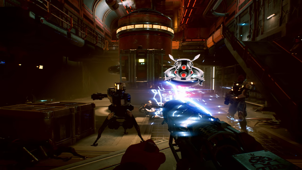
However it’s here that I need to make something clear, as while there’s a lot of beauty in this game when it comes to the quests and characters which all drip with personality and biting humor, the game itself isn’t as consistent with it’s graphics. There’s a huge difference between graphical style and graphical implementation, and while The Outer Worlds nails it’s STYLE, it’s not as outstanding when it comes to it’s landscapes.
The colourful billboards and loading screens that change to reflect your in game choices are brilliant; showcasing a humor and an art style that sells you perfectly on the tongue in cheek tone of the game, but the maps themselves which make up the player experience often feel like the saturation has been dialled up to its limit, and can often obscure a lot of details.
On PC the game does look really nice as my hands on time earlier on in the year proved, but on my base PS4, things looked fuzzy and confused when I was running across the jungled wastes. It’s not a problem if you own a high-end console or a PC, but for the masses who are running base systems, its balance between graphical awe and “awww nooo” is a little off balance.