The Witcher 3: Wild Hunt - 10 Glaring Flaws That Immediately Cripple It
3. The Menu Systems Can Be Very Hard To Read/Understand
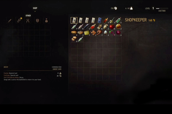
Even on a suitably large TV - tested in this author's case on a 50" - many items within the inventory space aren't readable in a large enough text size to get around you really focussing on them. It's a bit reminiscent of Dead Rising's problem way back in 2006, where the text was so small you had to make sure you were piping it through an HD cable to get enough fidelity to make out the font. Witcher's menus aren't that bad, but in general the menu/shop layout isn't very intuitive - especially in comparison to Witcher 2's. When looking at NPC's stock you're now presented with a large grid showing everything they have for sale, instead of the previous breakdown by category - something that strangely exists on your end if you'd like to sell. Also removed is the 'Inspect' option from before that would provide a more layman breakdown of what said item is going to do, meaning if an item 'Recovers Vitality' you've got no idea how many points that's worth until you buy one and try it out. All of this results in you thumbing through every small icon and reading the tiny paragraphs that pop up to get a basic idea of what you're about to purchase - which feels like quite a step back when these details were included in the last game.