7 Ups & 2 Downs From WWE SmackDown (May 7)
Downs...
2. The Set

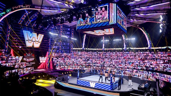
It really sucks for a child of the 80s to rag on WWE's retro vibes, but yours truly has no choice here. Being brutally honest, that 'block' style logo they whipped up for this 'Throwback' SmackDown was ill-fitting; SmackDown debuted in 1999, and that emblem was long gone by then.
WWE's graphical picks were all over the place.
Seeing them blend that 1999-2001 SmackDown logo with nameplates and other transitions straight out of 1988 didn't sit right. The company really had to be clearer about what they planned to present here, because an awful lot of older fans figured they were going to see the 'fist' set piece from 2001 this week.
Wide shots of the ThunderDome did look colourful, but they weren't very SmackDown-like. This felt rather awkward all night - it was like WWE wanted to pretend that the show had launched around the same time as Raw back in the early-90s, or something.