9 Ups & 2 Downs From NXT TakeOver: In Your House
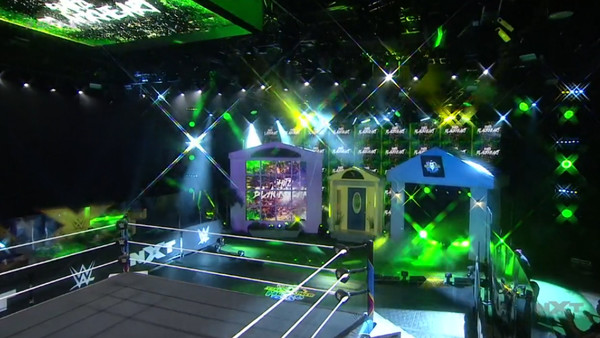
8. The Set Design

Also, that set design.
It brought childhood memories flooding back to see the old house set, one that was a nice change of pace from WWE's typically video screen heavy sets today. Most of the promotion's designs are too similar to stand out, but that really helped In Your House stand alone.
The fact these were actual, tangible set pieces instead of graphics on a screen helped as well. Seeing the old screen panel work on the left was awesome, and so was the addition of a garage (which almost everyone not-named Johnny Gargano strolled out of) and the actual house door (which Gargano lurked behind before his match).
WWE should honestly ponder revitalising some other old props for NXT. This worked, and there's a market for classic gems from the archives like No Mercy, Armageddon and the timeless Backlash swinging spikes set if they really put their minds to it.