10 Video Game Features Every Title Should Have Stolen
8. Integrated HUD - Dead Space

If you know you know, if you don’t, don’t worry, I’m going to give you the lowdown.
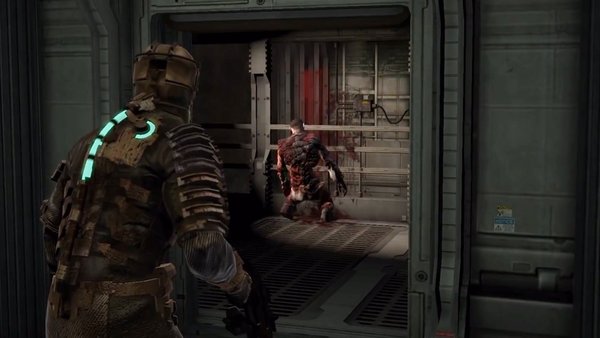
There is a strong argument to be made that Dead Space has one of the greatest user interfaces in all of video games. Dead Space’s HUD is especially good because the game doesn’t really have one. The HUD it does have is diegetic, meaning it exists in a way that suits Isaac and the game world, not as an artificial meta display created for the player.
Even those who aren’t all that jazzed about well-done user interfaces enjoyed the on-suit health meter, the intuitive seamless inventory menu that exists as a projection in game, and the way you’re guiding Isaac to interact with his HUD, not doing it for him outside of his experience. In particular, doing it this way meant the tension of the setting isn’t broken up by throwing up any barriers between the player and the survival horror experience.
Dead Space’s dedication to ensure that even its HUD feeds into the ludonarrative harmony of the game is really awesome and it’s a shame we haven’t seen it more often.