13 Iconic Video Games That Were Sold With Hilariously Terrible Box Art
2. ICO

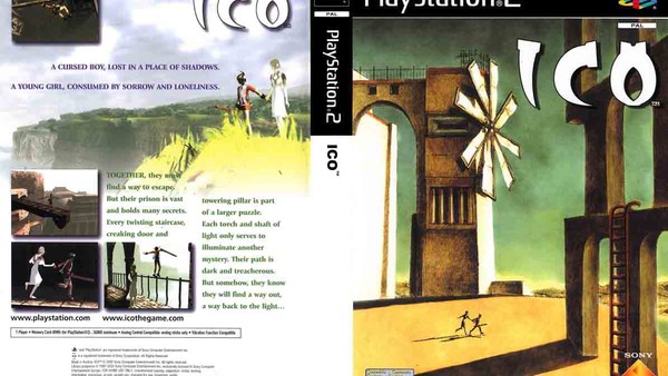
Divert your eyes southward, for just a second, if you please. See that? That's the box art for ICO's Japanese and European release. Clean, minimalist, mysterious and highly-stylized; those are the sorts of themes that one would expect to see promoted for Team Ico's breathtaking precursor to Shadow of the Colossus.

Now compare that gorgeous cover - which was hand-painted by ICO director Fumito Ueda, no less - to the tacky North American version adorning this entry. The stark contrast swiftly reveals the latter's spectacular failure in capturing and representing the tone of Ico and Yorda's adventure.
In fact, so universally reviled is the North American version, that even Sony's Yasuhide Kobayashi has, in the past, blamed its visage for ICO's near-to non-existant sales in the region.
It doesn't get more damning than that.