8 Big Budget Video Games RUINED By Terrible Graphics
Despite all the money thrown at them, some developers just can't even model a convincing face.

While graphics aren't everything, console and game developers often pride themselves on shifting units based on their visual tech being the best in the business.
They may not be everything, but graphics do account for a great deal - espeically as a first impression. Players will experience a game's visuals before they get to the gameplay, both through trailers long before release and through opening cutscenes, once they finally sit down to play the finished product.
Why then, have so many AAA titles over the years managed to make such a mess of this aspect of development?
Whether through cynical downgrades of what has been shown off to excite crowds, an imbalance between certain visual aspects or just that the developers did a rubbish job with the money at their disposal, sometimes poor presentation can tank an otherwise good game.
Unless of course, it was never a good game to begin with, and the graphics are simply another strike against the whole experience.
No matter their overall quality, good or bad, the following titles may have had everything going for them, but they look pretty damn janky.
8. Shenmue III

Shenmue III is not a "big budget" title compared to the Rockstars or Naughty Dogs of this world, but as a crowdfunding milestone, it should totally be singled out.
Raising over $7 million on Kickstarter, the game was the highest-funded video game in Kickstarter history. This neatly mirrored the original Shenmue's status as the most expensive video game ever developed at release. Acquiring further funding from Sony and Deep Silver, Shenmue III was finally released 18 years after its predecessor.
The finished product was sadly underwhelming. The game's clunky controls and laughably dated animation - plus a total lack of lip-syncing - were at odds with an unsuccessful attempt at modern graphics tech.
Shenmue III sits awkwardly between the old and the new, and not being quite as good as either makes for a less-than-enjoyable experience. A much wiser idea would have been to develop the game much more in line with its predecessors, capitalising on making a game that looked deliberately retro rather than failing to make a game that looked modern.
After all, pixel art and even low-poly 3D is all the rage in indie circles, so why not run with it?
7. The Amazing Spider-Man 2

The Amazing Spider-Man 2, the crap video-game tie-in to the crap Andrew Garfield sequel, pulled off an impressive feat by being ugly across 2 different console generations. Both the current and last-gen versions of the game were marred by dull, uninspired visuals to complement their dull, uninspired gameplay.
The primary release, for the PS4 and Xbox One, featured a repetitive-looking, lifeless New York City as its sandbox, lacking any distinctive character. Its character models were poor, as was its draw distance, with models popping in out of nowhere regularly. The PS3 and Xbox 360 port, however, was an absolute travesty.
Despite releasing in 2014, the game looked like it belonged on the PS2 circa 2007. Poor lighting, boxy buildings reminiscent of 2004's Spider-Man 2 and some of the worst texture and model loading imaginable was unforgivable for a game released several years after titles such as Far Cry 3 and the Uncharted series.
The fact that the last-gen versions were less of a priority than their primary ports can't be used as an excuse either. Far Cry 4 and Alien: Isolation were both released the same year and their ported-down siblings were nonetheless impressive.
6. WWE 2K20

WWE 2K20 is a disaster for a host of reasons. One of the worst video game launches in recent memory, it was plagued by crippling-yet-hilarious bugs, stale gameplay and a plodding progression system.
The game was in every way a massive step down from its predecessors, and those atrocious visuals didn't help matters. The graphical difference between 2K19 and 2K20 is like night and day - and it's 2K19 that looks superior by far.
Character models, despite having looked impressive and lifelike in the previous 2 entries, now look like waxwork figures more suited to an early PS3 title rather than the tail-end of the current generation of consoles.
Below is a handy comparison image of Stone Cold Steve Austin for reference:

It's truly baffling how a result so embarrassingly bad could have been achieved. Work has obviously been put in to remake character models from the ground up, but when the result is this poor, it seems like a lazy copy and paste job would have been preferable.
5. L.A. Noire

The problem with L.A. Noire - despite its myriad of gameplay issues - is not that the graphics are bad, but that they're utterly inconsistent.
In the run up its to release, the game was marketed heavily on pioneering MotionScan technology, recording each actor's face at 1000 frames per second with 32 cameras simultaneously. The results almost a decade on look incredibly impressive, with the nuance of each character's performance outstripping a great deal of current AAA titles.
Unfortunately, it seems like barely a fraction of the effort went into creating the rest of the characters' bodies. Even when compared to games of a similar era (the previous year's Red Dead Redemption, for example), clothing and bodily detail has a stiff, unnatural look to it.
Cloth doesn't appear to have any give, and has very little texture, resulting in each character moving more like an animated plastic doll than a convincing person. Coupled with the near-photorealistic heads plonked on top of these janky animatronic bodies, there's a feeling of disconnect that sends them toppling headlong into the uncanny valley.
4. Far Cry Vengeance

Far Cry, before its acquisition by Ubisoft, was the flagship release for developer Crytek's CryEngine. As a premiere of what was then the cutting edge of graphics tech, the PC exclusive was gorgeous for its time, rich with lush vegetation and stunning vistas.
Subsequent Far Cry releases on the Xbox, Xbox 360 and Nintendo Wii also utilised CryEngine 1 until Far Cry 2 made the switch to their new Dunia Engine. The Xbox titles, Instincts and Evolution, whilst losing some graphically fidelity and density in the move to consoles, still looked impressive and were considered way ahead of their time.
The same can't be said, however, for the Wii's 2006 entry Far Cry Vengeance.
The character models were subpar and poorly animated, and its insipid environments at times looked like they wouldn't have been out of place in an N64 shooter. Seriously, Turok: Dinosaur Hunter - game released 10 years previously - is on par with this.
Excuses could be made that the Wii was less powerful than the Xbox, but that argument rings hollow. The Legend Of Zelda: Twilight Princess was released the same year and looked bloody lovely.
Ubisoft, a company with a licence to print money, can do better than this.
3. Pac-Man (Atari 2600)

I know what you're all saying. How can a game for the Atari 2600, a console about as advanced a Rubik's Cube and with a lower resolution, have a game in its library that looks especially bad?
While it's true that the console was very limited in what it could achieve, titles such as Solaris and California Games managed to look pretty nice given their lack of resources.
This makes it all the more depressing that the Atari 2600 port of arcade marvel Pac-Man looks so blisteringly, appallingly dire. With a huge amount of copies ordered and an expensive marketing campaign, the development team predicted a simple conversion due to the game's success being based on gameplay and not visuals.
Not so, as anyone who has played Pac-Man remembers that it is full of visual personality and charm. The Atari port looked like absolute bumholes, with Pac-Man himself displaying barely any of his iconic features and the pursuing ghosts blinking at a seizure-inducing rate.
It may have the E. T. farce that ultimately caused the video game crash of 1983, but missteps such as this one certainly had a not-insignificant hand in it.
2. Aliens: Colonial Marines

Aliens: Colonial Marines is one of the previous console generation's biggest horror stories for a host of reasons. Its terrible state upon release was mired in controversy, with rumours of mismanagement and practices by developer Gearbox Software that essentially amounted to fraud.
A lawsuit was even filed against the studio, claiming false advertising based on previously released demo content that was far superior to the what people paid for.
Playing the game, it's clear what was shipped was an absolutely massive downgrade from its promotional materials (a practice now sadly commonplace in the games industry) - and alongside dull gameplay and laughably pathetic AI, Colonial Marines' graphics drew significant ire.
Its choppy frame rate, dingy, repetitive levels and outdated character models and animation made for a game that would have looked cutting edge had it released in the mid-2000s when production began.
Considering the length of time the game was in production and the fact that it released the same year as titles such as The Last Of Us and the Tomb Raider reboot makes its graphical quality, or lack thereof, all the more unacceptable.
1. Mass Effect: Andromeda
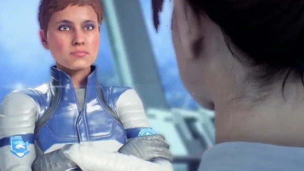
The Mass Effect series has never been a stranger to the uncanny valley, with its character models never seeming quite lifelike enough to warrant much praise.
However, the original trilogy made up for these flaws with wonderful gameplay, excellent storytelling and some breathtaking environment design. Despite Mass Effect 3's ending being widely ridiculed for its simplistic approach to a trilogy that prided itself on player choice, the trilogy is rightly well-regarded in most respects.
Mass Effect: Andromeda, released 5 years after the trilogy concluded, was a highly-anticipated follow up that sadly followed suit in undermining its overall quality with its visual issues.
Whilst its environments and vistas were once again breathtaking, making appropriate use of current-gen hardware, the game's character models and animations showed an entirely new level of ineptitude. Somehow looking worse than the 2007 original at times, facial animation is almost entirely absent from many cutscenes save for some poor lip syncing, and most characters display a dead-eyed stare comparable to a House Of Wax victim.
Most depressing of all is the fact that the gameplay was otherwise serviceable - it didn't really break new ground and wasn't quite the giant leap that the series needed, but it was a truly sad case of an experience completely overshadowed by some appalling graphics.